16 Difference-in-Differences
In this chapter you will estimate the “Garbage Incinerator” Difference-In-Differences model discussed in LN6. You will also see an example of a model that includes polynomials. Here’s what you need to do:
- Wherever it says “WRITE YOUR CODE HERE”, write code. I’ll label the entire code chunk with this, and then put in additional comments to walk you through what to do specifically. When you start there will be error many messages (because I included code for some tables using results you have to create). After you’ve written all the code you need to write, there should not be any more error messages in the output.
- Wherever it says “WRITE YOUR ANSWER HERE”, write your answer. These areas will be between three asterisks (which add horizontal lines before and after your answer) and HTML tags
div class="textSoln"(which make your answer in red font). Make sure to keep your answers between these markings.
Note that this chapter will be graded, rather than Redo, Check Minus, Check, Check Plus with possibilities of a redo for Redo or Check Minus.
16.1 Data
library(tidyverse)
library(pander)
library(stargazer)

## Set how many decimals at which R starts to use scientific notation
options(scipen=4)

## Load data
mydata <- read_csv("https://raw.githubusercontent.com/LhostEcon/380data/main/garbageIncineratorDD.csv")
The data has 321 observations on house prices in North Andover, MA. The variables include:
| Variable | Description |
|---|---|
| year | 1978 or 1981 |
| dist | miles from incinerator |
| rprice | price, 1978 dollars (“r” means real price, corrected for inflation) |
| age | age of house in years |
| rooms | # rooms in house |
| baths | # bathrooms |
| area | house size in square feet |
| land | land area in square feet |
The relevant background is covered in LN6, but I’ll summarize it again. We have house prices in 1978 and 1981 in North Andover, MA. In 1978 no one knows about any garbage incinerator, so prices in 1978 cannot be affected by the garbage incinerator. In 1979 it was announced publicly that a new garbage incinerator would be built and operational by 1981. The variable “dist” has the distance in miles from the future location of the incinerator. We want to estimate if knowledge of the future incinerator lowered house prices for houses near the incinerator. We’ll define “near” as within 3 miles of the incinerator location.
stargazer(as.data.frame(mydata),
          type = "html",
summary.stat = c("n","mean","sd", "min", "median", "max"))| Statistic | N | Mean | St. Dev. | Min | Median | Max |
| year | 321 | 1,979.327 | 1.492 | 1,978 | 1,978 | 1,981 |
| dist | 321 | 3.923 | 1.611 | 0.947 | 3.769 | 7.576 |
| rprice | 321 | 83,721.350 | 33,118.790 | 26,000.000 | 82,000.000 | 300,000.000 |
| age | 321 | 18.009 | 32.566 | 0 | 4 | 189 |
| rooms | 321 | 6.586 | 0.901 | 4 | 7 | 10 |
| baths | 321 | 2.340 | 0.771 | 1 | 2 | 4 |
| area | 321 | 2,106.729 | 694.958 | 735 | 2,056 | 5,136 |
| land | 321 | 39,629.890 | 39,514.390 | 1,710 | 43,560 | 544,500 |
Note that I put mydata inside as.data.frame(). Sometimes stargazer doesn’t work otherwise (as some of you found out in the CP).
16.2 Model 1
Estimate the following model and store the results in model1
\[rprice=\beta_0+\beta_1near+\beta_2y81+\beta_3near\cdot y81+u\] where
| Variable | Description |
|---|---|
| near | =1 if house is 3 miles or less from incinerator location, = 0 o/w |
| y81 | =1 if house sold in 1981, = 0 o/w |
Fill in your code in the code chunk below. You need to generate the near and y81 variables a variable for the interaction term (i.e., y81near=y81*near).
Tip about creating dummy variables: If you use something like dist<=3 to create near, it will create a column of TRUE and FALSE. If you put the condition in parentheses and multiply by 1, it will turn TRUE into 1 and FALSE into 0. Thus, (dist<=3)*1 is equivalent to ifelse(dist<=3,1,0)
Tip (or, more of a requirement for 380) about interaction terms: R will let you include y81*near in the regression directly, but do not do this in 380 (and I suggest not doing it after 380 either, at least unless you check to make sure it’s doing what you think it’s doing). Frequently people make mistakes when they rely on R to include the interactions for them. To be sure that you know what the interaction terms are, you need to create them yourself. So create the interaction term yourself. You can name it y81near.
After you create the three variables, estimate the regression, store the regression results in model1, and display the results using pander.
Then, use group_by() and summarize to calculate the mean price for the four groups (far 1978, far 1981, near 1978, near 1981). Store the results in a dataframe named comparison.
Finally, add to comparison a column with the predicted price for each of the 4 groups using the regression coefficients. They should be close to identical, which you can verify by calculation the difference.
Display comparison using pander(comparison).
## WRITE YOUR CODE HERE (below each of the comments in this code chunk)

## Create 3 variables (near, y81, and y81near)
mydata <- mydata %>%
  mutate(near = (dist<=3)*1) %>%
  mutate(y81 = (year == 1981)*1) %>%
  mutate(y81near = (dist<=3)*(year == 1981)*1)

## Estimate model
model1 <- lm(rprice ~ near + y81 + y81near, data = mydata)

pander(summary(model1))| Estimate | Std. Error | t value | Pr(>|t|) | |
|---|---|---|---|---|
| (Intercept) | 82517 | 2727 | 30.26 | 1.709e-95 |
| near | -18824 | 4875 | -3.861 | 0.0001368 |
| y81 | 18790 | 4050 | 4.64 | 0.000005117 |
| y81near | -11864 | 7457 | -1.591 | 0.1126 |
| Observations | Residual Std. Error | \(R^2\) | Adjusted \(R^2\) |
|---|---|---|---|
| 321 | 30243 | 0.1739 | 0.1661 |
## 4 group averages using group_by() and summarize()
## and store it in table named comparison
comparison <- mydata %>%
  group_by(near, y81) %>%
  summarize(priceAvg = mean(rprice))
## `summarise()` has grouped output by 'near'. You can override using the
## `.groups` argument.## Create a column named regression so that you can store the values from the regression
## corresponding with the averages just calculated using group_by() and summarize()
## Initially sat it to NA (then fill in each value below)
comparison$regression <- NA
## Now replace the NAs one at a time separately for each group
## Leave the value as-is except for the particular group.
## There are many ways to do it. I use ifelse()
## I'll fill in the first one for you so it's clear what you can do
## (but if you want to do it a different way, feel free)
## far 1978
comparison$regression <- ifelse(comparison$near == 0 & comparison$y81 == 0,
coef(model1)["(Intercept)"],
comparison$regression)
## far 1981
comparison$regression <- ifelse(comparison$near == 0 & comparison$y81 == 1,
coef(model1)["(Intercept)"] + coef(model1)["y81"],
comparison$regression)
## near 1978
comparison$regression <- ifelse(comparison$near == 1 & comparison$y81 == 0,
coef(model1)["(Intercept)"] + coef(model1)["near"],
comparison$regression)
## near 1981
comparison$regression <- ifelse(comparison$near == 1 & comparison$y81 == 1,
coef(model1)["(Intercept)"] + coef(model1)["near"] + coef(model1)["y81"] + coef(model1)["y81near"],
comparison$regression)
## Calculate the difference (should be very close to 0 if the averages and regression results are identical)
comparison$dif <- comparison$regression - comparison$priceAvg
## Display the comparison dataframe to show that the averages and regression results are identical
## (using pander to display the table, which we can do because it only has 4 lines)
pander(comparison)| near | y81 | priceAvg | regression | dif |
|---|---|---|---|---|
| 0 | 0 | 82517 | 82517 | -1.455e-11 |
| 0 | 1 | 101308 | 101308 | 1.455e-11 |
| 1 | 0 | 63693 | 63693 | -1.455e-11 |
| 1 | 1 | 70619 | 70619 | 4.366e-11 |
16.2.1 Equivalent model 1
In LN6 we discuss an equivalent model that defines dummy variables for each group. Create the set of group dummy variables and estimate the model. Store it in model1equiv. Calculate the conditional expectation for the four groups and add them to the comparison dataframe as a new column named regressionEquiv (and add a dif2 column to show that the values are identical).
## WRITE YOUR CODE HERE (below each of the comments in this code chunk)

## Create Variables
mydata <- mydata %>%
  mutate(y78far = ifelse(dist > 3 & year == 1978,1,0)) %>%
  mutate(y81far = ifelse(dist > 3 & year == 1981,1,0)) %>%
  mutate(y78near = ifelse(dist <= 3 & year == 1978,1,0))

## we already created y81near above

## Estimate model
model1equiv <- lm(rprice ~ y81far + y78near + y81near +y78far, data = mydata)

pander(summary(model1equiv))| Estimate | Std. Error | t value | Pr(>|t|) | |
|---|---|---|---|---|
| (Intercept) | 82517 | 2727 | 30.26 | 1.709e-95 |
| y81far | 18790 | 4050 | 4.64 | 0.000005117 |
| y78near | -18824 | 4875 | -3.861 | 0.0001368 |
| y81near | -11898 | 5505 | -2.161 | 0.03141 |
| Observations | Residual Std. Error | \(R^2\) | Adjusted \(R^2\) |
|---|---|---|---|
| 321 | 30243 | 0.1739 | 0.1661 |
## Create a column named regressionEquiv so that you can store the values from this regression
## corresponding with the averages and regression results calculated earlier
## Initially sat it to NA (then fill in each value below)
comparison$regressionEquiv <- NA

## Now replace the NAs one at a time separately for each group, as you did above

## far 1978
comparison$regressionEquiv <- ifelse(comparison$near == 0 & comparison$y81 == 0,
                                coef(model1equiv)["(Intercept)"],
                                comparison$regression)

## far 1981
comparison$regressionEquiv <- ifelse(comparison$near == 0 & comparison$y81 == 1,
                                coef(model1equiv)["(Intercept)"] + coef(model1equiv)["y81far"],
                                comparison$regression)

## near 1978
comparison$regressionEquiv <- ifelse(comparison$near == 1 & comparison$y81 == 0,
                                coef(model1equiv)["(Intercept)"] + coef(model1equiv)["y78far"],
                                comparison$regression)
## near 1981
comparison$regressionEquiv <- ifelse(comparison$near == 1 & comparison$y81 == 1,
                                coef(model1equiv)["(Intercept)"] + coef(model1equiv)["y81near"],
                                comparison$regression)

## Calculate the difference (should be very close to 0 if the averages and regression results are identical)
comparison$dif2 <- comparison$regressionEquiv - comparison$regression

## Display the comparison dataframe to show that the averages and regression results are identical
## (using pander to display the table, which we can do because it only has 4 lines)
pander(comparison)| near | y81 | priceAvg | regression | dif | regressionEquiv | dif2 |
|---|---|---|---|---|---|---|
| 0 | 0 | 82517 | 82517 | -1.455e-11 | 82517 | 0 |
| 0 | 1 | 101308 | 101308 | 1.455e-11 | 101308 | 0 |
| 1 | 0 | 63693 | 63693 | -1.455e-11 | 63693 | 0 |
| 1 | 1 | 70619 | 70619 | 4.366e-11 | 70619 | -7.276e-11 |
16.3 Model 2
Now estimate the following model
\[ \begin{align} rprice=\beta_0+\beta_1near+\beta_2y81+\beta_3near\cdot y81 &+\beta_4age+\beta_5age^2 + \beta_6rooms \\ &+ \beta_7baths+\beta_8area+\beta_9land+u \end{align} \]
where \(age^2\) is the variable age squared. Store your regression results in model2. Note that if you want to use \(age^2\) inside lm() instead of creating the agesq variable first, you need to put the age^2 inside I(). But I suggest creating agesq manually so you’re positive you’re using what you want to use.
## WRITE YOUR CODE HERE

## add variable named agesq mydata
mydata <- mydata %>%
  mutate(agesq = age^2)

## Estimate regression that includes age and agesq
model2 <- lm(rprice ~ near + y81 + y81near + age + agesq + rooms, data = mydata)
pander(summary(model2))| Estimate | Std. Error | t value | Pr(>|t|) | |
|---|---|---|---|---|
| (Intercept) | 7355 | 12435 | 0.5914 | 0.5547 |
| near | 13166 | 4545 | 2.897 | 0.004032 |
| y81 | 20944 | 3228 | 6.489 | 3.359e-10 |
| y81near | -21834 | 5960 | -3.664 | 0.0002918 |
| age | -1154 | 133.6 | -8.635 | 3.002e-16 |
| agesq | 6.157 | 0.8805 | 6.992 | 1.631e-11 |
| rooms | 11869 | 1775 | 6.686 | 1.051e-10 |
| Observations | Residual Std. Error | \(R^2\) | Adjusted \(R^2\) |
|---|---|---|---|
| 321 | 23937 | 0.4874 | 0.4776 |
16.4 Comparison of models
Here we display the two models in a stargazer table. First we’ll display them with the p-values. Then we’ll display them with standard errors, next with the t-statistic, and finally with the 95% confidence interval. It’s common for results to be presenting with one of these four statistics, so it’s important for you to be comfortable with each choice. Note that you do NOT want to display multiple tables of the same models like I’m doing here. We’re only displaying this to make sure you understand what the various statistics are telling you and how they connect to each other.
I’ve included the stargazer tables for you. Until you estimate the models this will display errors in the output,.
stargazer(model1, model2,
type = "html",
report=('vc*p'),
keep.stat = c("n","rsq","adj.rsq"),
notes = "p-value reported in parentheses, <em>*p<0.1;**p<0.05;***p<0.01</em>",
notes.append = FALSE)| Dependent variable: | ||
| rprice | ||
| (1) | (2) | |
| near | -18,824.370*** | 13,165.980*** |
| p = 0.0002 | p = 0.005 | |
| y81 | 18,790.290*** | 20,944.310*** |
| p = 0.00001 | p = 0.000 | |
| y81near | -11,863.900 | -21,834.420*** |
| p = 0.113 | p = 0.0003 | |
| age | -1,154.061*** | |
| p = 0.000 | ||
| agesq | 6.157*** | |
| p = 0.000 | ||
| rooms | 11,868.560*** | |
| p = 0.000 | ||
| Constant | 82,517.230*** | 7,354.538 |
| p = 0.000 | p = 0.555 | |
| Observations | 321 | 321 |
| R2 | 0.174 | 0.487 |
| Adjusted R2 | 0.166 | 0.478 |
| Note: | p-value reported in parentheses, *p<0.1;**p<0.05;***p<0.01 | |
stargazer(model1, model2,
type = "html",
report=('vc*s'),
keep.stat = c("n","rsq","adj.rsq"),
notes = "standard error reported in parentheses, <em>*p<0.1;**p<0.05;***p<0.01</em>",
notes.append = FALSE)| Dependent variable: | ||
| rprice | ||
| (1) | (2) | |
| near | -18,824.370*** | 13,165.980*** |
| (4,875.322) | (4,544.660) | |
| y81 | 18,790.290*** | 20,944.310*** |
| (4,050.065) | (3,227.551) | |
| y81near | -11,863.900 | -21,834.420*** |
| (7,456.646) | (5,959.791) | |
| age | -1,154.061*** | |
| (133.644) | ||
| agesq | 6.157*** | |
| (0.881) | ||
| rooms | 11,868.560*** | |
| (1,775.209) | ||
| Constant | 82,517.230*** | 7,354.538 |
| (2,726.910) | (12,435.460) | |
| Observations | 321 | 321 |
| R2 | 0.174 | 0.487 |
| Adjusted R2 | 0.166 | 0.478 |
| Note: | standard error reported in parentheses, *p<0.1;**p<0.05;***p<0.01 | |
stargazer(model1, model2,
type = "html",
report=('vc*t'),
keep.stat = c("n","rsq","adj.rsq"),
notes = "t-statistic reported for each coefficient, <em>*p<0.1;**p<0.05;***p<0.01</em>",
notes.append = FALSE)| Dependent variable: | ||
| rprice | ||
| (1) | (2) | |
| near | -18,824.370*** | 13,165.980*** |
| t = -3.861 | t = 2.897 | |
| y81 | 18,790.290*** | 20,944.310*** |
| t = 4.640 | t = 6.489 | |
| y81near | -11,863.900 | -21,834.420*** |
| t = -1.591 | t = -3.664 | |
| age | -1,154.061*** | |
| t = -8.635 | ||
| agesq | 6.157*** | |
| t = 6.992 | ||
| rooms | 11,868.560*** | |
| t = 6.686 | ||
| Constant | 82,517.230*** | 7,354.538 |
| t = 30.260 | t = 0.591 | |
| Observations | 321 | 321 |
| R2 | 0.174 | 0.487 |
| Adjusted R2 | 0.166 | 0.478 |
| Note: | t-statistic reported for each coefficient, *p<0.1;**p<0.05;***p<0.01 | |
stargazer(model1, model2,
type = "html",
ci = TRUE,
ci.level = 0.95,
keep.stat = c("n","rsq","adj.rsq"),
notes = "95% confidence interval reported in parentheses, <em>*p<0.1;**p<0.05;***p<0.01</em>",
notes.append = FALSE)| Dependent variable: | ||
| rprice | ||
| (1) | (2) | |
| near | -18,824.370*** | 13,165.980*** |
| (-28,379.830, -9,268.915) | (4,258.611, 22,073.350) | |
| y81 | 18,790.290*** | 20,944.310*** |
| (10,852.310, 26,728.270) | (14,618.420, 27,270.190) | |
| y81near | -11,863.900 | -21,834.420*** |
| (-26,478.660, 2,750.855) | (-33,515.390, -10,153.440) | |
| age | -1,154.061*** | |
| (-1,415.998, -892.124) | ||
| agesq | 6.157*** | |
| (4.431, 7.883) | ||
| rooms | 11,868.560*** | |
| (8,389.210, 15,347.900) | ||
| Constant | 82,517.230*** | 7,354.538 |
| (77,172.580, 87,861.870) | (-17,018.510, 31,727.590) | |
| Observations | 321 | 321 |
| R2 | 0.174 | 0.487 |
| Adjusted R2 | 0.166 | 0.478 |
| Note: | 95% confidence interval reported in parentheses, *p<0.1;**p<0.05;***p<0.01 | |
16.5 Additional questions
16.5.1 Question 1
Based on model 1, what effect did the garbage incinerator have on house prices for houses “near” (within 3 miles of) the incinerator? Is this effect statistically significant?
Based on model 1, being near the incinerator had a negative effect on housing prices, as the variable near has a coefficient of -18824.37. This coefficient represents the difference in average expected price of a house built in 1978 that is near the incinerator and a house built in 1978 that is not near. So a 1978 house that is near the incinerator will cost, on average, $-18824.37 less than a 1978 house that is not near it. The relationship between being near and house price is statistically significant at the 1% level.
16.5.2 Question 2
Here is how you can easily report the confidence intervals for model1 for the 3 standard (i.e., commonly used/reported) levels of significance:
pander(confint(model1,level = 0.99))| 0.5 % | 99.5 % | |
|---|---|---|
| (Intercept) | 75451 | 89584 |
| near | -31458 | -6190 |
| y81 | 8295 | 29286 |
| y81near | -31187 | 7459 |
pander(confint(model1,level = 0.95))| 2.5 % | 97.5 % | |
|---|---|---|
| (Intercept) | 77152 | 87882 |
| near | -28416 | -9232 |
| y81 | 10822 | 26759 |
| y81near | -26535 | 2807 |
pander(confint(model1,level = 0.90))| 5 % | 95 % | |
|---|---|---|
| (Intercept) | 78019 | 87016 |
| near | -26867 | -10782 |
| y81 | 12109 | 25472 |
| y81near | -24165 | 437.1 |
To reach the same conclusion about statistical significance of the effect of the garbage incinerator as your answer to the previous question (for which you looked at the p-value), what level confidence interval do we need to look at? Why?
Since the previous question looked at the statistical significance of near, which was at the 1% level, that means we would need to look at the .5% to 99.5% interval. That means in only 1% of our random samplings do we not see our value of the coefficient present in the confidence interval. There is a 1% chance we can see that coefficient as large as it is if there is really no relationship between the price and the house being near the incinerator. We are willing to reject the null hypothesis when there is a 1% chance it is true. Looking at this confidence interval would allows us to check if our standard error and t-value are consistent with the interval. By dividing the confidence interval by our standard error, we can find the critical value and compare it to our t-value.
16.5.3 Question 3
Now look at the second model. Based on model2, what effect did the garbage incinerator have on house prices for houses “near” (within 3 miles of) the incinerator? Is this effect statistically significant?
Based on model 2, being near the incinerator had a positive effect on housing prices, as the variable near has a coefficient of 13165.981. This coefficient represents the difference in average expected price of a house built in 1978 that is near the incinerator and a house built in 1978 that is not near. So a 1978 house that is near the incinerator will cost, on average, $-13165.981 more than a 1978 house that is not near it. The relationship between being near and house price is statistically significant at the 1% level.
***
pander(confint(model2,level = 0.99))| 0.5 % | 99.5 % | |
|---|---|---|
| (Intercept) | -24873 | 39582 |
| near | 1388 | 24944 |
| y81 | 12580 | 29309 |
| y81near | -37280 | -6389 |
| age | -1500 | -807.7 |
| agesq | 3.875 | 8.439 |
| rooms | 7268 | 16469 |
pander(confint(model2,level = 0.95))| 2.5 % | 97.5 % | |
|---|---|---|
| (Intercept) | -17113 | 31822 |
| near | 4224 | 22108 |
| y81 | 14594 | 27295 |
| y81near | -33561 | -10108 |
| age | -1417 | -891.1 |
| agesq | 4.425 | 7.89 |
| rooms | 8376 | 15361 |
pander(confint(model2,level = 0.90))| 5 % | 95 % | |
|---|---|---|
| (Intercept) | -13160 | 27870 |
| near | 5669 | 20663 |
| y81 | 15620 | 26269 |
| y81near | -31666 | -12002 |
| age | -1375 | -933.6 |
| agesq | 4.705 | 7.61 |
| rooms | 8940 | 14797 |
16.5.4 Question 4
Calculate the confidence interval needed to reach the same conclusion about statistical significance of the effect of the garbage incinerator as your answer to the previous question (for which you looked at the p-value)? Explain why this is the level you need to look at to reach that conclusion.
The previous question also looked at the statistical significance of near, which was at the 1% level, that means we would need to look at the .5% to 99.5% interval. That means in only 1% of our random samplings do we not see our value of the coefficient present in the confidence interval. There is a 1% chance we can see that coefficient as large as it is if there is really no relationship between the price and the house being near the incinerator. We are willing to reject the null hypothesis when there is a 1% chance it is true. Looking at this confidence interval would allow us to check if our standard error and t-value are consistent with the interval. Since the confidence interval is +/- 11777.98, and the standard error is 4544.660, we just need a t-value larger than 2.5916, which we see in the third stargazer table.
16.6 Polynomials
For this part I’ve left in all the code, so there’s nothing you have to do here. However, I suggest you go through the code and experiment a bit until you understand what’s going on with polynomial models.
In model 2 you included a second order polynomial in age (i.e., you included age and age squared). What this allows for is the regression line to have a parabolic shape instead of being a straight line. To see an example of this, consider the following two models, the first that only includes age and the second that includes age and age squared.
Note that this part will display errors until you do the work above.
mydata$agesq <- mydata$age^2
modelAge <- lm(rprice~age,data=mydata)
pander(modelAge)| Estimate | Std. Error | t value | Pr(>|t|) | |
|---|---|---|---|---|
| (Intercept) | 89799 | 1996 | 44.98 | 3.838e-140 |
| age | -337.5 | 53.71 | -6.283 | 1.086e-09 |
mydata$yHatAge <- fitted(modelAge)


modelAge2 <- lm(rprice~age+agesq,data=mydata)
pander(modelAge2)| Estimate | Std. Error | t value | Pr(>|t|) | |
|---|---|---|---|---|
| (Intercept) | 98512 | 1904 | 51.73 | 6.692e-157 |
| age | -1457 | 115.2 | -12.65 | 5.333e-30 |
| agesq | 8.293 | 0.7812 | 10.62 | 9.799e-23 |
mydata$yHatAge2 <- fitted(modelAge2)

ggplot(data=mydata,aes(y=rprice,x=age)) +
  geom_point(shape=4) +
  geom_point(aes(y=yHatAge,x=age),color="blue",size=2)  +
  geom_line(aes(y=yHatAge,x=age),color="blue") +
  geom_point(aes(y=yHatAge2,x=age),color="green",size=2)  +
geom_line(aes(y=yHatAge2,x=age),color="green") 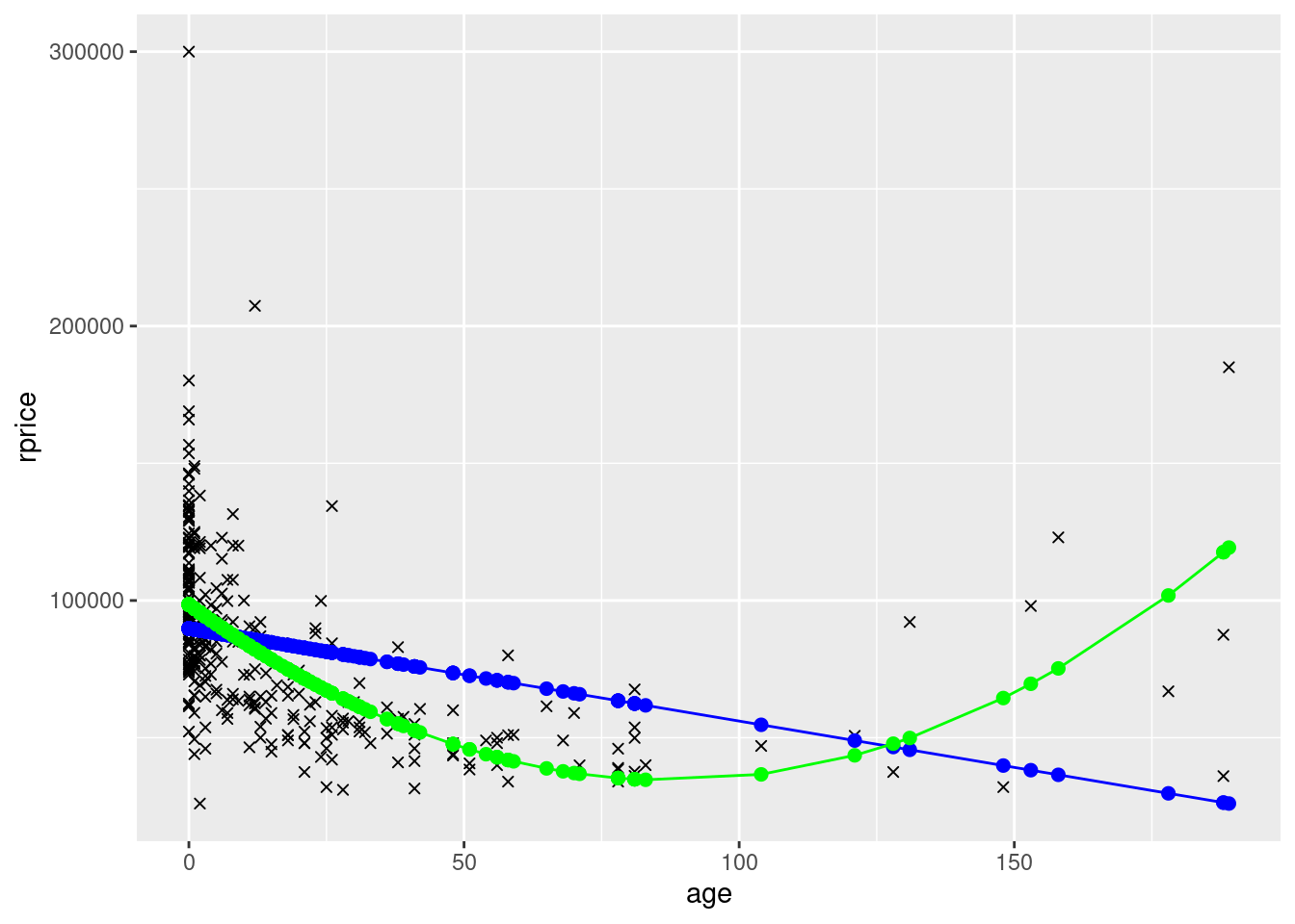
To see a slightly more complete model, also including near, y81, and y81near. Let’s define a factor variable that will indicate the four groups by color. We’ll first display the graph for the model that only includes age (plus near, y81, and y81near). Then we’ll display the graph for the model that also includes age squared.
## Create variable with group (so that we can later use color=group in ggplot)
mydata$group <- ifelse(mydata$near==0 & mydata$year==1978,"y78far",
                       ifelse(mydata$near==1 & mydata$year==1978,"y78near",
                       ifelse(mydata$near==0 & mydata$year==1981,
                       "y81far","y81near")))

## Model with just linear age (and dummies)

modelAgeWithGroups <- lm(rprice~age+near+y81+y81near,data=mydata)
mydata$yHatAgeWithGroups <- fitted(modelAgeWithGroups)

ggplot(data=mydata,aes(y=rprice,x=age,color=group)) +
  geom_point(shape=4) +
  geom_point(aes(y=yHatAgeWithGroups,x=age,color=group),size=2)  +
geom_line(aes(y=yHatAgeWithGroups,x=age,color=group)) 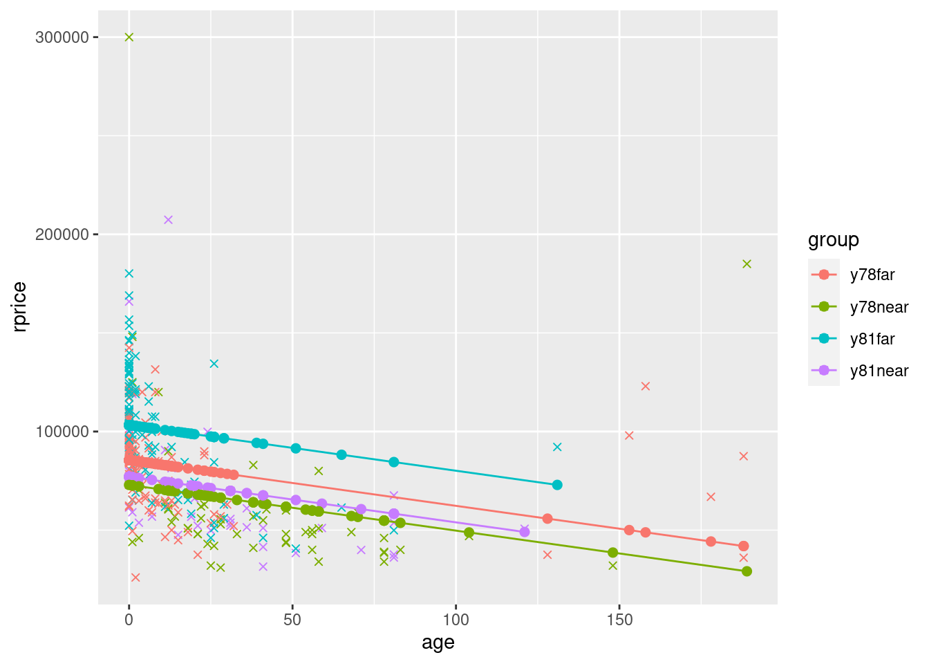
## Model with quadratic age (and dummies)
modelAge2WithGroups <- lm(rprice~age+agesq+near+y81+y81near,data=mydata)
pander(modelAge2WithGroups)| Estimate | Std. Error | t value | Pr(>|t|) | |
|---|---|---|---|---|
| (Intercept) | 89117 | 2406 | 37.04 | 8.248e-117 |
| age | -1494 | 131.9 | -11.33 | 3.348e-25 |
| agesq | 8.691 | 0.8481 | 10.25 | 1.859e-21 |
| near | 9398 | 4812 | 1.953 | 0.05171 |
| y81 | 21321 | 3444 | 6.191 | 1.857e-09 |
| y81near | -21920 | 6360 | -3.447 | 0.0006445 |
mydata$yHatAge2WithGroups <- fitted(modelAge2WithGroups)

ggplot(data=mydata,aes(y=rprice,x=age,color=group)) +
  geom_point(shape=4) +
  geom_point(aes(y=yHatAge2WithGroups,x=age,color=group),size=2)  +
  geom_line(aes(y=yHatAge2WithGroups,x=age,color=group)) +
  scale_color_manual(values=c("red", "orange", "green","blue"))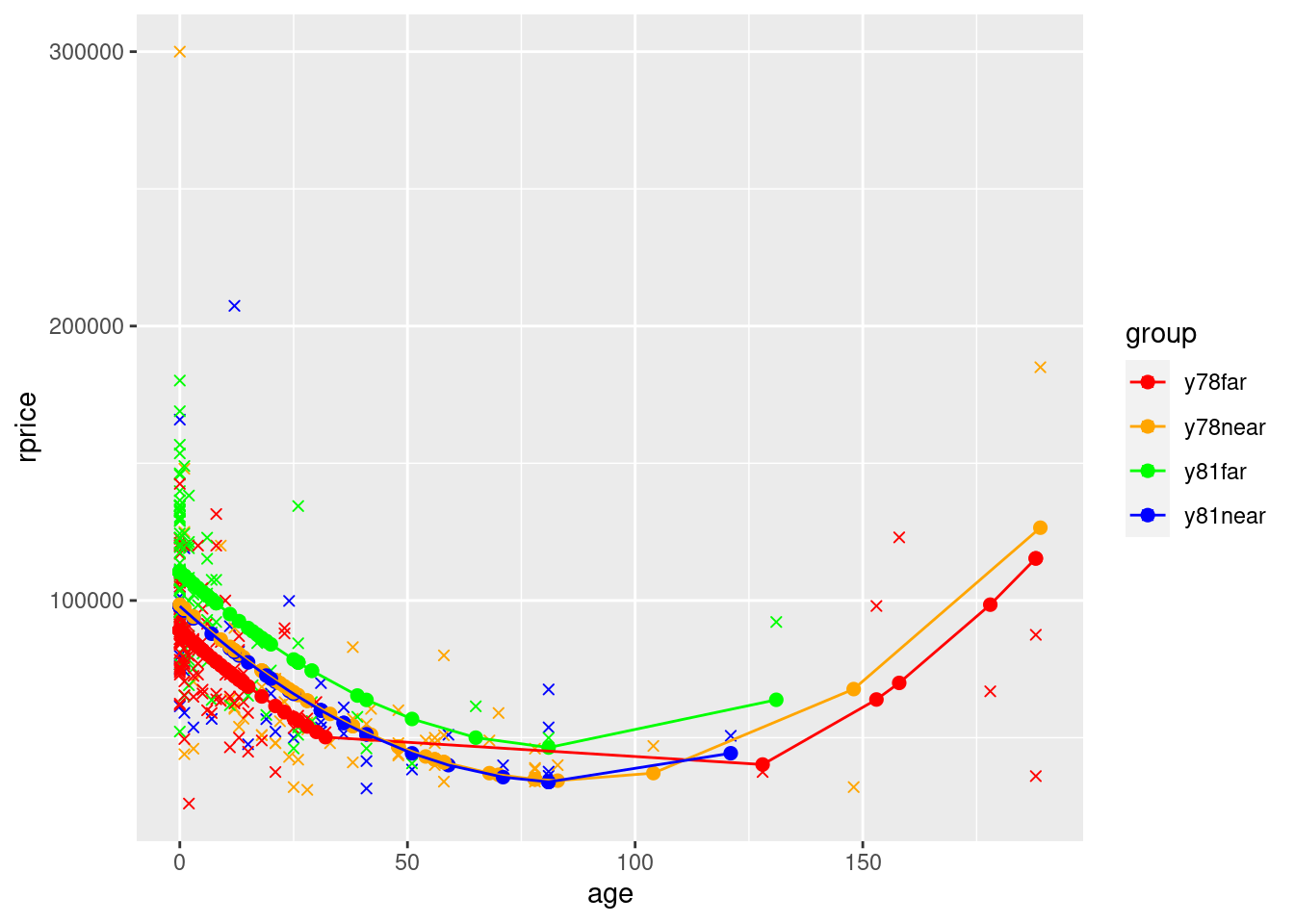
What you see in the polynomial graphs is that include age squared allows for a nonlinear relationship. Here, initially house price goes down as the house gets older. However, after about 100 years, older houses start to sell for more. This makes sense. Initially getting older is bad because older houses are more likely to have problems, require repairs, etc. But a hundred+ year old house is probably a pretty nice house if it’s survived that long, it might be considered “historic”, etc. We can’t possibly capture that relationship unless we specify our model in a way that allows for a nonlinear relationship. Sometimes you will also see a cubic term. That allows for three turns in the relationship (down, up, down, or up, down, up).
Here I used scale_color_manual to explicitly set the colors. The default colors were fine, but below in what follows we’re going to plot the lines manually. For this, we need to set the colors manually. It is easier to match the colors if we use scale_color_manual for the parts that ggplot can do on its own. But if you were just making the graph above, letting it pick the colors will often be fine (i.e., don’t feel like you always need to set the colors manually…part of the point of using gglot is that it does a pretty good job on its own).
Note that in the final graph, the only reason the lines overlap is because ggplot simply connects the dots. Because the x values are spaced out, it essentially cuts the corner, making flat portions instead of keeping the parabolic shape. If there were more points the bottom wouldn’t be flat and the lines wouldn’t cross.
That said, clearly the way it cuts the corners makes it not look like the graph of a parabola. To fix this (which you need to do if you wanted to graph a model with a quadratic), you can do the equivalent of manually creating the yHat values (instead of using fitted() that only creates points based on the actual x values). Here is an example of how to do so:
## Create dataframe to hold fake x values (recall 1:200 is 1, 2, 3, ..., 200)
squareLines <- data.frame(xVals=1:200)

## add yHat values for each of the x values for each group
squareLines$yHayA_far78 <- coef(modelAge2WithGroups)["(Intercept)"] +
                            coef(modelAge2WithGroups)["age"]*squareLines$xVals +
                            coef(modelAge2WithGroups)["agesq"]*squareLines$xVals^2
squareLines$yHayA_near78 <- coef(modelAge2WithGroups)["(Intercept)"] +
                            coef(modelAge2WithGroups)["near"] +
                            coef(modelAge2WithGroups)["age"]*squareLines$xVals +
                            coef(modelAge2WithGroups)["agesq"]*squareLines$xVals^2
squareLines$yHayA_far81 <- coef(modelAge2WithGroups)["(Intercept)"] +
                            coef(modelAge2WithGroups)["y81"] +
                            coef(modelAge2WithGroups)["age"]*squareLines$xVals +
                            coef(modelAge2WithGroups)["agesq"]*squareLines$xVals^2
squareLines$yHayA_near81 <- coef(modelAge2WithGroups)["(Intercept)"] +
                            coef(modelAge2WithGroups)["near"] +
                            coef(modelAge2WithGroups)["y81"] +
                            coef(modelAge2WithGroups)["y81near"] +
                            coef(modelAge2WithGroups)["age"]*squareLines$xVals +
                            coef(modelAge2WithGroups)["agesq"]*squareLines$xVals^2

## This graph uses 2 dataframes, so we specify the data in each geom
## If you try to specify one dataframe in ggplot() and the second in the geom, it doesn't work
ggplot() +
  geom_point(data=mydata,aes(y=rprice,x=age,color=group),shape=4) +
  geom_line(data=squareLines,aes(x=xVals, y=yHayA_far78),color="red") +
  geom_line(data=squareLines,aes(x=xVals, y=yHayA_near78),color="orange") +
  geom_line(data=squareLines,aes(x=xVals, y=yHayA_far81),color="green") +
  geom_line(data=squareLines,aes(x=xVals, y=yHayA_near81),color="blue") +
  geom_point(data=mydata,aes(y=yHatAge2WithGroups,x=age,color=group),size=2)  +
  scale_color_manual(values=c("red", "orange", "green","blue"))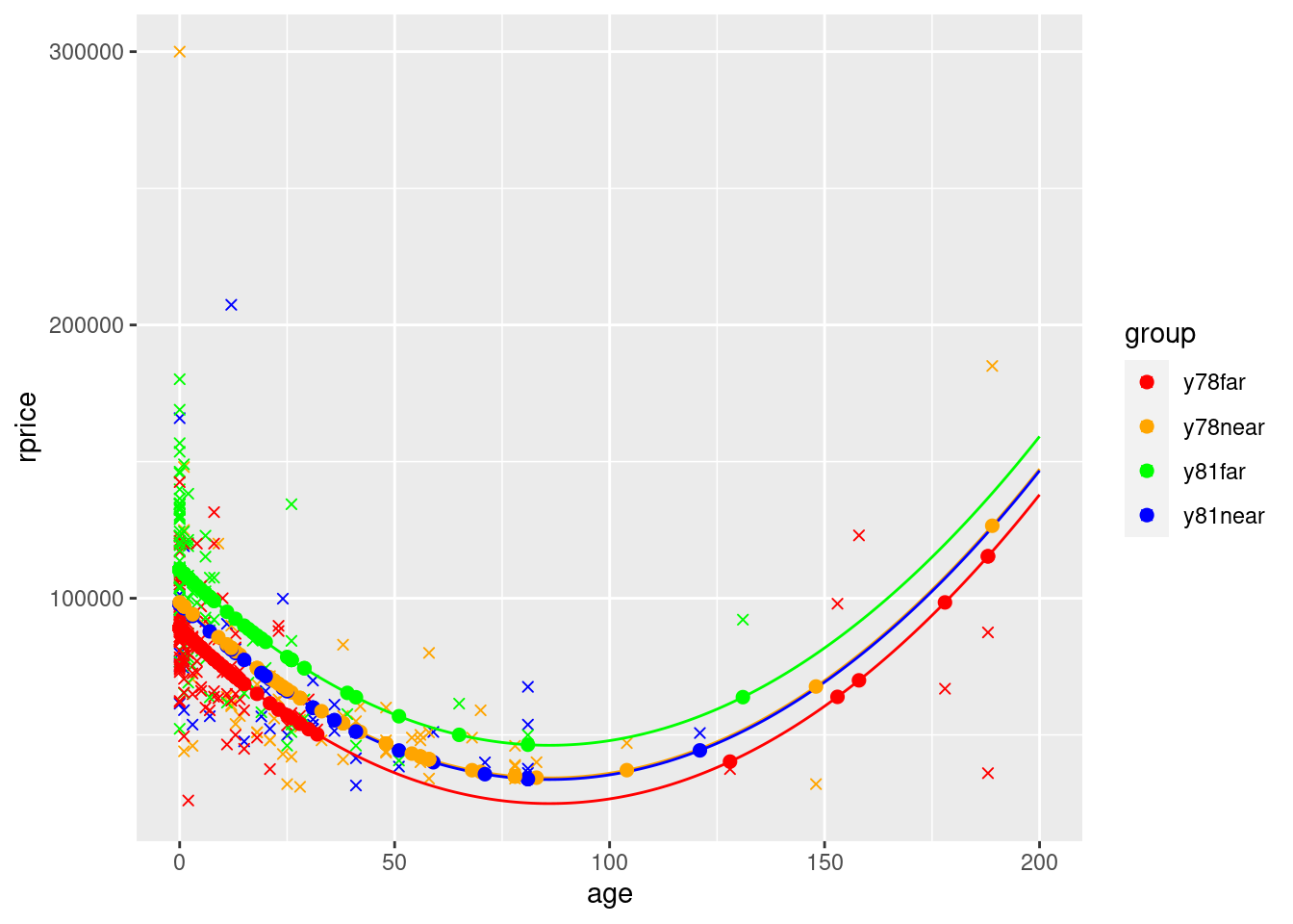
In the graph you see how the lines for near in the two time periods are almost on top of each other. This is because the coefficient on y81 shifts the line up by 21321, but the coefficient on y81nearshifts it back down by close to the same amount (21920).
To make a graph like this last one for a model that includes more continuous x variables (such as the main model above that includes the number of rooms and bathrooms and the size of the house and land), you would need to shift the lines up or down to account for those other variables. The most common way to do so is to multiply each of the additional coefficients (i.e., all coefficients that aren’t dummy variables or the variable on the x axis) by the average value of that variable.
pander(model2)| Estimate | Std. Error | t value | Pr(>|t|) | |
|---|---|---|---|---|
| (Intercept) | 7355 | 12435 | 0.5914 | 0.5547 |
| near | 13166 | 4545 | 2.897 | 0.004032 |
| y81 | 20944 | 3228 | 6.489 | 3.359e-10 |
| y81near | -21834 | 5960 | -3.664 | 0.0002918 |
| age | -1154 | 133.6 | -8.635 | 3.002e-16 |
| agesq | 6.157 | 0.8805 | 6.992 | 1.631e-11 |
| rooms | 11869 | 1775 | 6.686 | 1.051e-10 |
mydata$yHatModel2 <- fitted(model2)

## Calculate the value to add to the intercept using the average values in the data for all continuous variables except age (the one that's on the x axis)
## We ignore the dummy variables because we need to create separate lines for each combination of dummy variables
constantShifter <- coef(model2)["rooms"]*mean(mydata$rooms) +
                    coef(model2)["baths"]*mean(mydata$baths) +
                    coef(model2)["area"]*mean(mydata$area) +
                    coef(model2)["land"]*mean(mydata$land)


## Create dataframe to hold fake x values (recall 1:200 is 1, 2, 3, ..., 200)
squareLines2 <- data.frame(xVals=1:200)

## add yHat values for each of the x values for each group
squareLines2$yHayA_far78 <- coef(model2)["(Intercept)"] +
                            constantShifter +
                            coef(model2)["age"]*squareLines2$xVals +
                            coef(model2)["agesq"]*squareLines2$xVals^2
squareLines2$yHayA_near78 <- coef(model2)["(Intercept)"] +
                            constantShifter +
                            coef(model2)["near"] +
                            coef(model2)["age"]*squareLines2$xVals +
                            coef(model2)["agesq"]*squareLines2$xVals^2
squareLines2$yHayA_far81 <- coef(model2)["(Intercept)"] +
                            constantShifter +
                            coef(model2)["y81"] +
                            coef(model2)["age"]*squareLines2$xVals +
                            coef(model2)["agesq"]*squareLines2$xVals^2
squareLines2$yHayA_near81 <- coef(model2)["(Intercept)"] +
                            constantShifter +
                            coef(model2)["near"] +
                            coef(model2)["y81"] +
                            coef(model2)["y81near"] +
                            coef(model2)["age"]*squareLines2$xVals +
                            coef(model2)["agesq"]*squareLines2$xVals^2

## this graph uses 2 dataframes, so we specify the data in each geom
## If you try to specify one dataframe in ggplot() and the second in the geom, it doesn't work
ggplot() +
  geom_point(data=mydata,aes(y=rprice,x=age,color=group),shape=4) +
  geom_line(data=squareLines2,aes(x=xVals, y=yHayA_far78),color="red") +
  geom_line(data=squareLines2,aes(x=xVals, y=yHayA_near78),color="orange") +
  geom_line(data=squareLines2,aes(x=xVals, y=yHayA_far81),color="green") +
  geom_line(data=squareLines2,aes(x=xVals, y=yHayA_near81),color="blue") +
  geom_point(data=mydata,aes(y=yHatModel2,x=age,color=group),size=2)  +
  scale_color_manual(values=c("red", "orange", "green","blue"))
## Warning: Removed 200 rows containing missing values (`geom_line()`).
## Removed 200 rows containing missing values (`geom_line()`).
## Removed 200 rows containing missing values (`geom_line()`).
## Removed 200 rows containing missing values (`geom_line()`).
Notice how the yHat points are no longer on the lines. This is because they use the actual values of rooms, baths, area, and land instead of the averages
One thing to note about the approach we just followed is that we used the average values of rooms, baths, area, and land in the entire dataset. If the average values of these variables are similar for the 4 groups, this is approximately correct. However, the larger the differences across groups in the averages of the other variables, the further off the lines might be. Here is a way to use the group-specific average values for each group.
## Create dataframe with group-specific averages of the other continuous variables
meanByGroup <- mydata %>% select(y81, near, rooms, baths, area, land) %>%
                group_by(y81, near) %>%
                summarise(avgRooms = mean(rooms),
                          avgBaths = mean(baths),
                          avgArea = mean(area),
                          avgLand = mean(land)) %>%
                as.data.frame() # the part below doesn't work if it's not a dataframe
## `summarise()` has grouped output by 'y81'. You can override using the `.groups`
## argument.pander(meanByGroup)| y81 | near | avgRooms | avgBaths | avgArea | avgLand |
|---|---|---|---|---|---|
| 0 | 0 | 6.829 | 2.512 | 2075 | 52569 |
| 0 | 1 | 6.036 | 1.857 | 1835 | 21840 |
| 1 | 0 | 6.765 | 2.598 | 2351 | 40251 |
| 1 | 1 | 6.15 | 1.825 | 1962 | 23164 |
## Create dataframe to hold fake x values (recall 1:200 is 1, 2, 3, ..., 200)
squareLines3 <- data.frame(xVals=1:200)

## add yHat values for each of the x values for each group
squareLines3$yHayA_far78 <- coef(model2)["(Intercept)"] +
      coef(model2)["rooms"] * meanByGroup[(meanByGroup$near==0 & meanByGroup$y81==0),"avgRooms"] +
      coef(model2)["baths"] * meanByGroup[(meanByGroup$near==0 & meanByGroup$y81==0),"avgBaths"] +
      coef(model2)["area"] *  meanByGroup[(meanByGroup$near==0 & meanByGroup$y81==0),"avgArea"] +
      coef(model2)["land"] *  meanByGroup[(meanByGroup$near==0 & meanByGroup$y81==0),"avgLand"] +
      coef(model2)["age"]*squareLines3$xVals +
      coef(model2)["agesq"]*squareLines3$xVals^2
squareLines3$yHayA_near78 <- coef(model2)["(Intercept)"] +
      coef(model2)["rooms"] * meanByGroup[(meanByGroup$near==1 & meanByGroup$y81==0),"avgRooms"] +
      coef(model2)["baths"] * meanByGroup[(meanByGroup$near==1 & meanByGroup$y81==0),"avgBaths"] +
      coef(model2)["area"] *  meanByGroup[(meanByGroup$near==1 & meanByGroup$y81==0),"avgArea"] +
      coef(model2)["land"] *  meanByGroup[(meanByGroup$near==1 & meanByGroup$y81==0),"avgLand"] +
                            coef(model2)["near"] +
                            coef(model2)["age"]*squareLines3$xVals +
                            coef(model2)["agesq"]*squareLines3$xVals^2
squareLines3$yHayA_far81 <- coef(model2)["(Intercept)"] +
      coef(model2)["rooms"] * meanByGroup[(meanByGroup$near==0 & meanByGroup$y81==1),"avgRooms"] +
      coef(model2)["baths"] * meanByGroup[(meanByGroup$near==0 & meanByGroup$y81==1),"avgBaths"] +
      coef(model2)["area"] *  meanByGroup[(meanByGroup$near==0 & meanByGroup$y81==1),"avgArea"] +
      coef(model2)["land"] *  meanByGroup[(meanByGroup$near==0 & meanByGroup$y81==1),"avgLand"] +
                            coef(model2)["y81"] +
                            coef(model2)["age"]*squareLines3$xVals +
                            coef(model2)["agesq"]*squareLines3$xVals^2
squareLines3$yHayA_near81 <- coef(model2)["(Intercept)"] +
      coef(model2)["rooms"] * meanByGroup[(meanByGroup$near==1 & meanByGroup$y81==1),"avgRooms"] +
      coef(model2)["baths"] * meanByGroup[(meanByGroup$near==1 & meanByGroup$y81==1),"avgBaths"] +
      coef(model2)["area"] *  meanByGroup[(meanByGroup$near==1 & meanByGroup$y81==1),"avgArea"] +
      coef(model2)["land"] *  meanByGroup[(meanByGroup$near==1 & meanByGroup$y81==1),"avgLand"] +
                            coef(model2)["near"] +
                            coef(model2)["y81"] +
                            coef(model2)["y81near"] +
                            coef(model2)["age"]*squareLines3$xVals +
                            coef(model2)["agesq"]*squareLines3$xVals^2

## this graph uses 2 dataframes, so we specify the data in each geom
## If you try to specify one dataframe in ggplot() and the second in the geom, it doesn't work
ggplot() +
  geom_point(data=mydata,aes(y=rprice,x=age,color=group),shape=4) +
  geom_line(data=squareLines3,aes(x=xVals, y=yHayA_far78),color="red") +
  geom_line(data=squareLines3,aes(x=xVals, y=yHayA_near78),color="orange") +
  geom_line(data=squareLines3,aes(x=xVals, y=yHayA_far81),color="green") +
  geom_line(data=squareLines3,aes(x=xVals, y=yHayA_near81),color="blue") +
  geom_point(data=mydata,aes(y=yHatModel2,x=age,color=group),size=2)  +
  scale_color_manual(values=c("red", "orange", "green","blue"))
## Warning: Removed 200 rows containing missing values (`geom_line()`).
## Removed 200 rows containing missing values (`geom_line()`).
## Removed 200 rows containing missing values (`geom_line()`).
## Removed 200 rows containing missing values (`geom_line()`).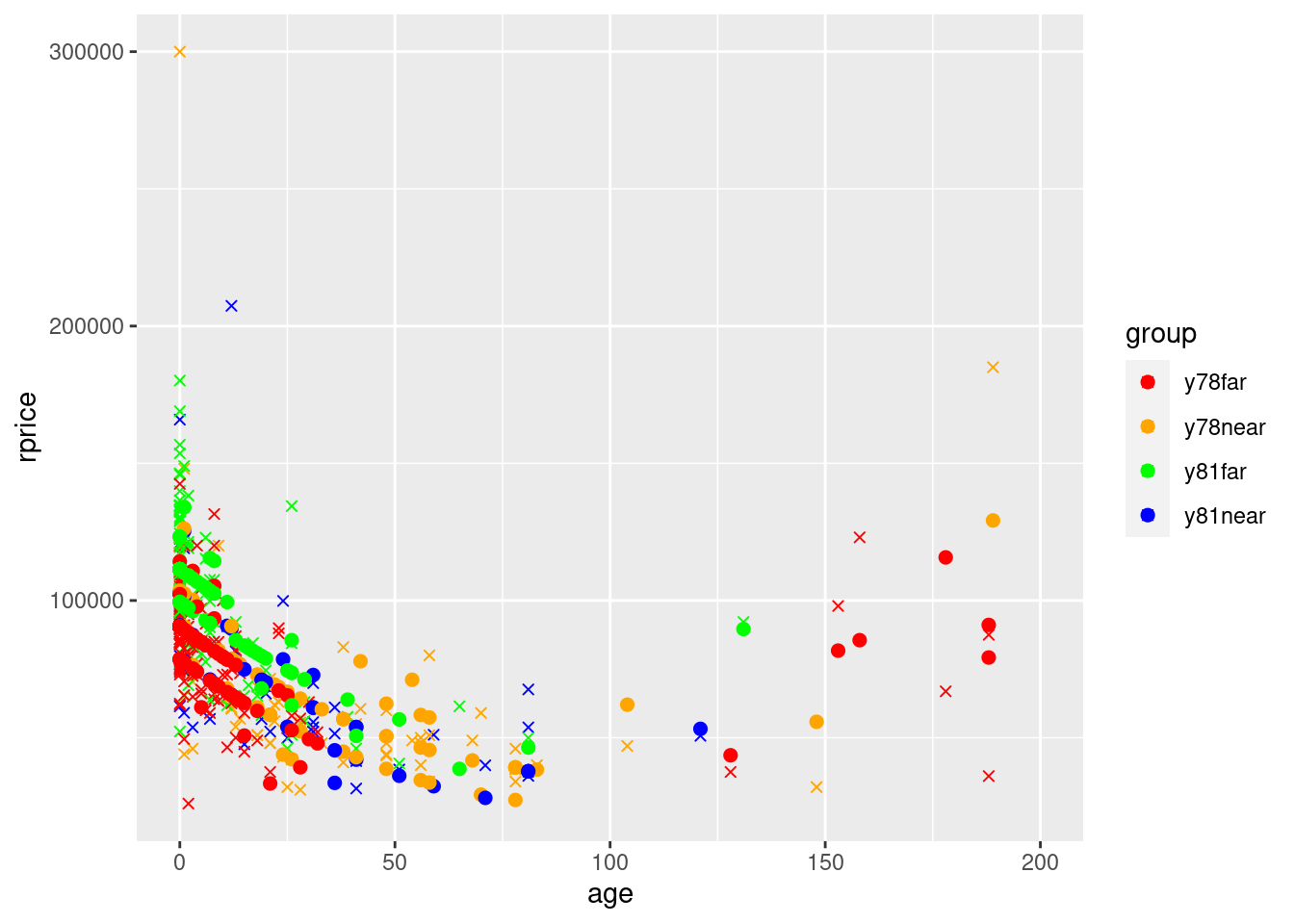
Using group-specific averages doesn’t make a huge difference, but it is noticeable. You can now clearly see all 4 lines due to this additional variation resulting from using group-specific averages.