4 Intro to Data Visualization with ggplot2
https://learn.datacamp.com/courses/introduction-to-data-visualization-with-ggplot2
Main functions and concepts covered in this BP chapter:
aes()Aesthetics- non
aesAesthetics - Aesthetic Modification
- Positions
- Types of Plots
theme()
Packages used in this chapter:
## Load all packages used in this chapter
library(tidyverse) #includes dplyr, ggplot2, and other common packages
## ── Attaching packages ─────────────────────────────────────── tidyverse 1.3.2 ──
## ✔ ggplot2 3.4.0 ✔ purrr 0.3.5
## ✔ tibble 3.1.8 ✔ dplyr 1.0.10
## ✔ tidyr 1.2.1 ✔ stringr 1.5.0
## ✔ readr 2.1.3 ✔ forcats 0.5.2
## ── Conflicts ────────────────────────────────────────── tidyverse_conflicts() ──
## ✖ dplyr::filter() masks stats::filter()
## ✖ dplyr::lag() masks stats::lag()# used for vocab dataset
library(carData)
# If you run code to create plt_prop_unemployed_over_time, you need lubridate
library(lubridate)## Loading required package: timechange
##
## Attaching package: 'lubridate'
##
## The following objects are masked from 'package:base':
##
## date, intersect, setdiff, union# For the themes chapter
library(ggthemes)
## For the last plot
library(gapminder)
library(RColorBrewer)
library(Lock5Data)Datasets used in this chapter:
## Load datasets used in this chapter
# mtcars, diamonds, economics: part of tidyverse package
# vocab: part of carData package
load("data/fish.RData") # fish.species dataset
#sleepstudy and happyplanet data set: part of Lock5Data package
Note: A few exercises use the mtcars variable fcyl. They added the fcyl variable to mtcars. It is simply the cyl variable as a factor You know how to do this from learning about mutate in the previous BP chapter (i.e., mtcars <- mtcars %>% mutate(fcyl = factor(cyl))). You also need to do the same thing to create fam, which is the factor version of am.
Note2 : Similarly, for the Vocab dataset, you need to convert education and vocabulary to factor, e.g., Vocab <- Vocab %>% mutate(education = factor(education)) and similarly for vocabulary.
Note 3: this BP chapter is on Introduction to Data Visualization with ggplot2, to further your skills (including some that might be useful later in 380), you are free to also explore Intermediate Data Visualization with ggplot2
4.1 Introduction
#Using a scatter plot to display a discrete variable on the x-axis produces an output but it implies that there might be  grade levels in between 1 and 2, 2 and 3, etc.
ggplot(sleepstudy, aes(ClassYear, AverageSleep)) + geom_point()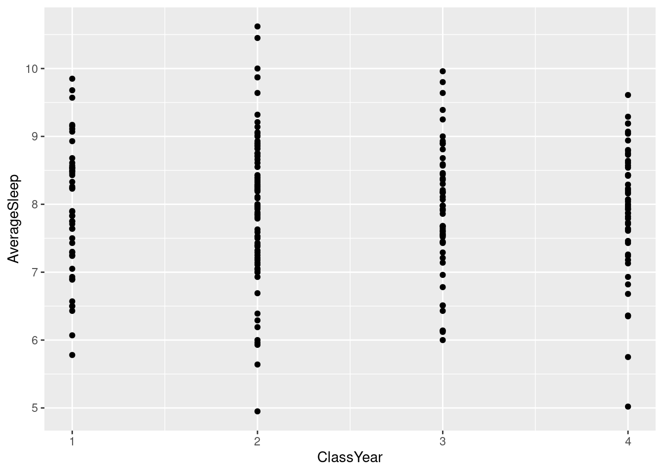
#To fix this, we can add `factor()` around ClassYear so it is clear that is is not a numerical variable even though it is represented with  numbers.

#Although this doesn't change the look of the graph very much, in cases where there is no category in between numbers, the `factor()` would remove those values from the graph (i.e. if there was no grade 3, it would take out 3 on the x-axis and just have 1, 2, and 4).

ggplot(sleepstudy, aes(factor(ClassYear), AverageSleep)) + geom_point()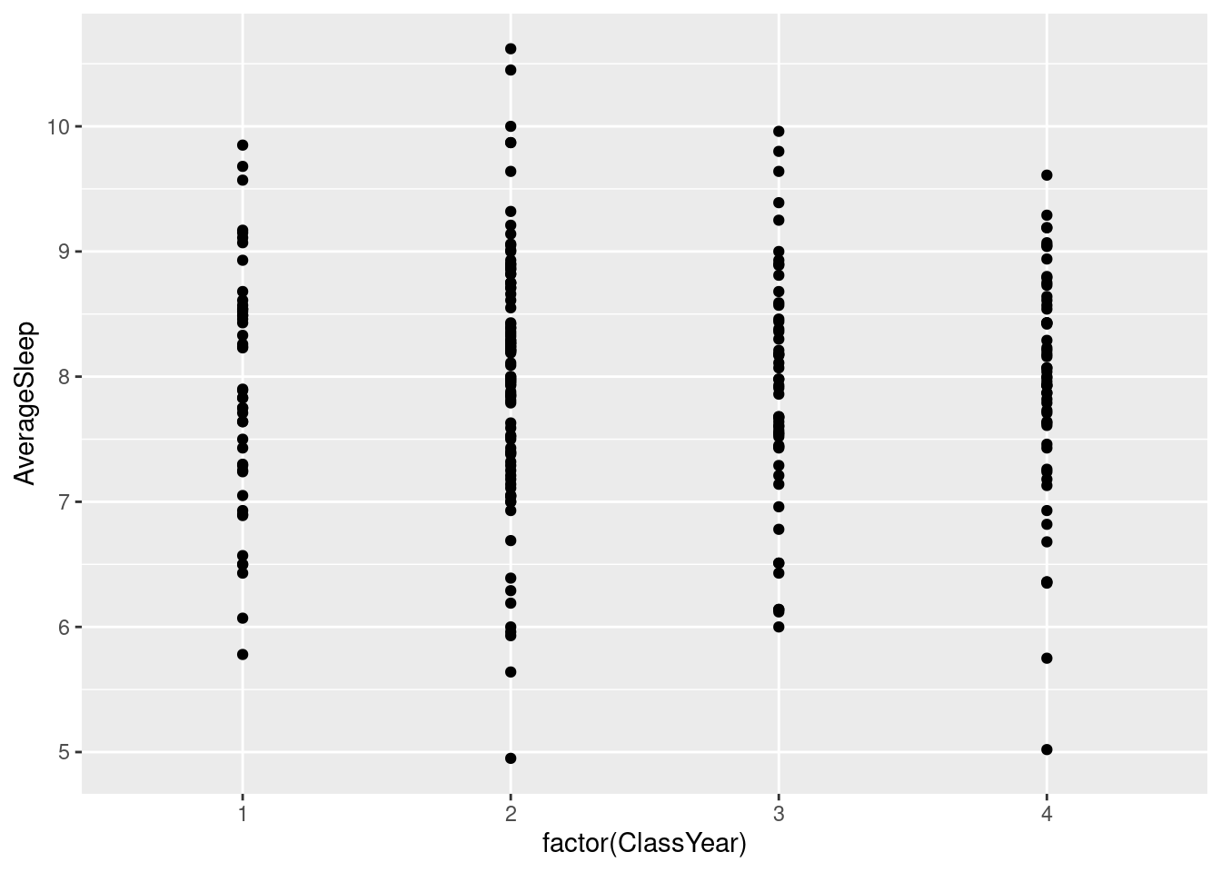
#We can layer two or more graphs on top of each other. Here we can use `geom_point()` and `geom_smooth()` to create a graphic with both points and a line.

ggplot(happyplanet, aes(LifeExpectancy, Happiness)) + geom_point() + geom_smooth(color = "purple") + xlab("Life Expectancy")
## `geom_smooth()` using method = 'loess' and formula = 'y ~ x'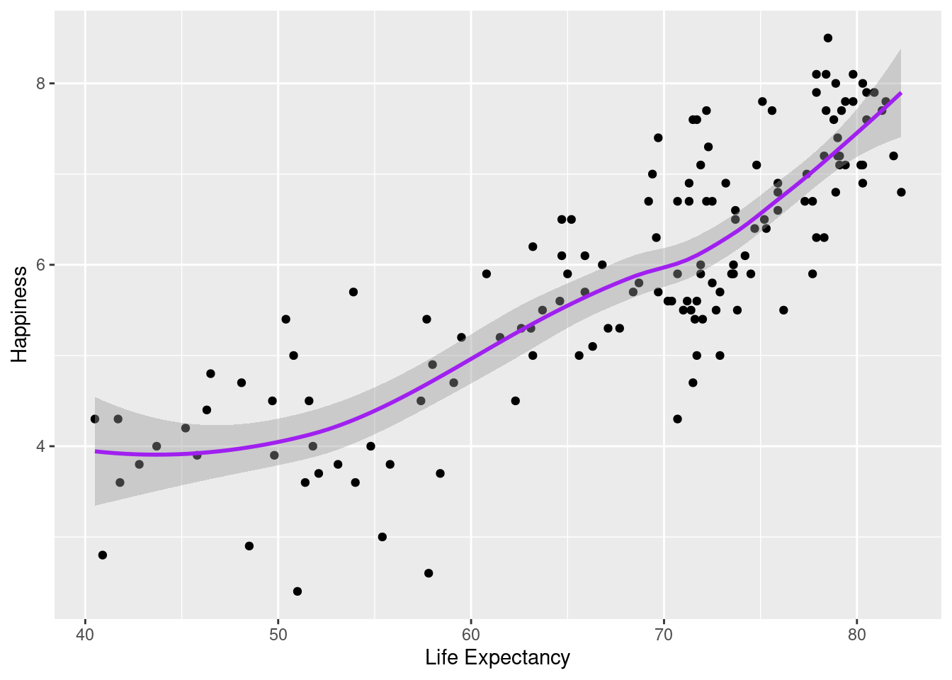
#Using footprint as color for both graphs, but specifying that the points for the scatter plot have a transparency of .2 using alpha =.

ggplot(happyplanet, aes(LifeExpectancy, Happiness, color = footprint)) + geom_point(alpha = .2) + geom_smooth() + xlab("Life Expectancy")
## `geom_smooth()` using method = 'loess' and formula = 'y ~ x'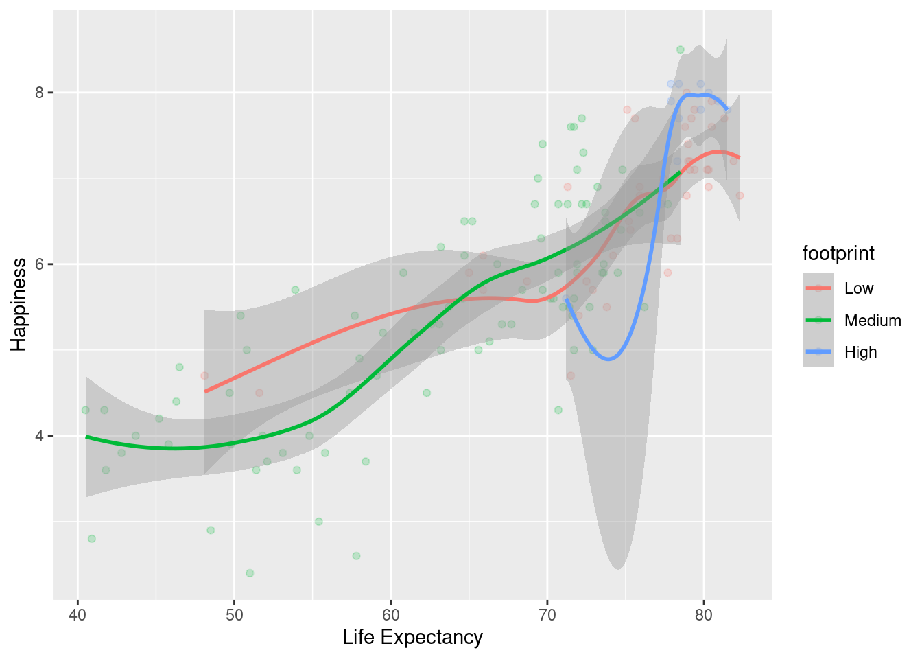
+ to add on more layers as needed.
#Save the plot with life expectancy as x and happiness as y to `lifexp_happy`.
lifexp_happy <- ggplot(happyplanet, aes(LifeExpectancy, Happiness))

#Add `geom_point`() to create scatter plot
lifexp_happy + geom_point()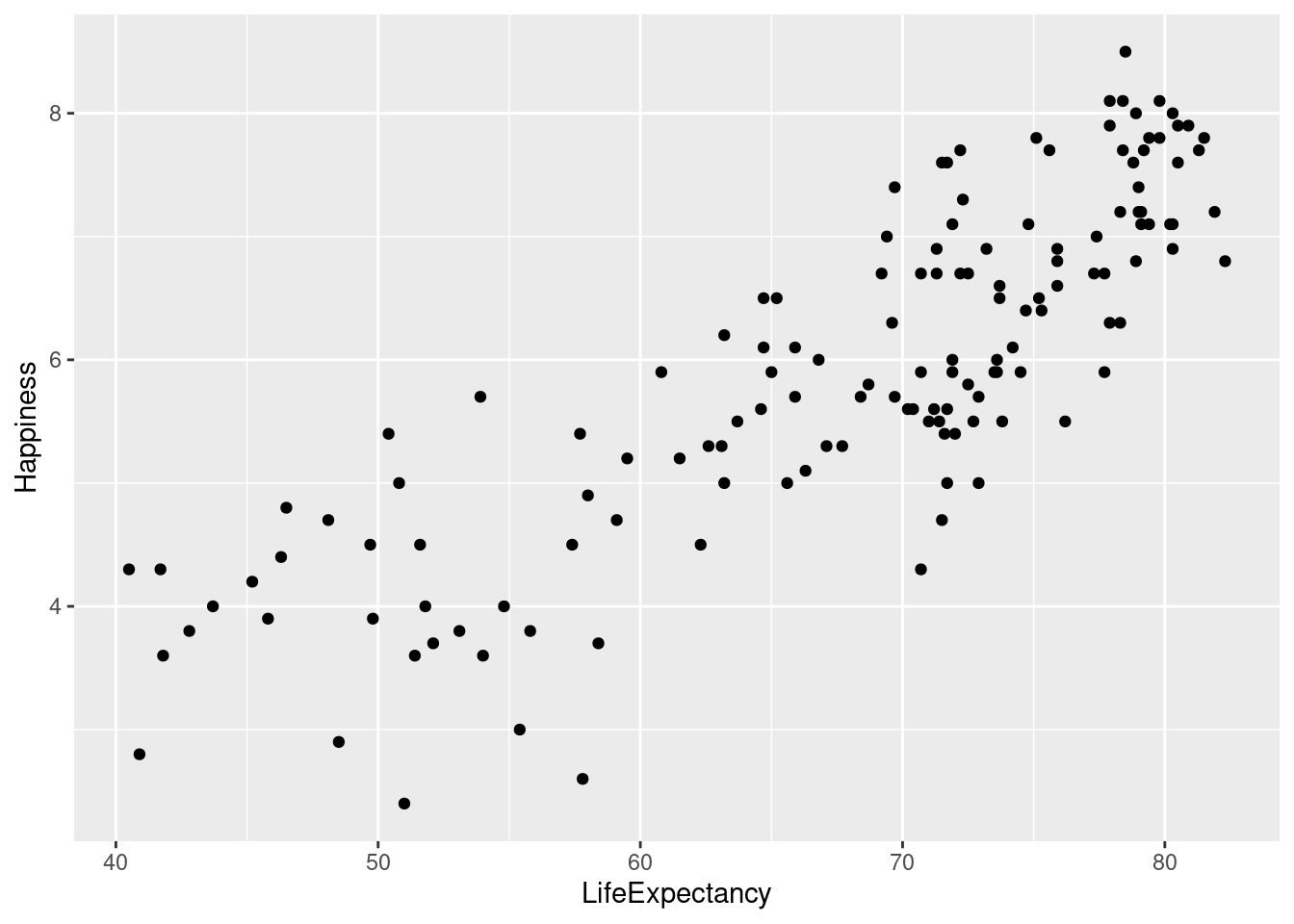
#Add aesthetics to `geom_point()` and save to new variable.
lifexp_happy_region <- lifexp_happy + geom_point(aes(color = region))

#Print out new graph
lifexp_happy_region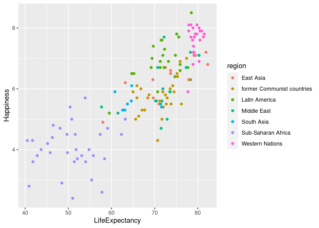
4.2 Aesthetics
4.2.1 Aes() and non Aes() Aesthetics
These are the aesthetics you can consider within aes() in this chapter: x, y, color, fill, size, alpha, labels, and shape.
One common convention is that you don’t name the x and y arguments to aes(), since they almost always come first, but you do name other arguments.
aes() and in that case, they don’t correspond to a variable, but an actual color, shape, size, etc.
Here are some helpful links for remembering which shape, fill, color, etc. corresponds to certain numbers/names.
- Shapes*: http://www.sthda.com/english/wiki/ggplot2-point-shapes
- Color/Fill: http://www.cookbook-r.com/Graphs/Colors_(ggplot2)/
*note that setting “shape =”.”” sets the point size to 1 pixel
ggplot(happyplanet, aes(LifeExpectancy, Happiness, color = region)) + geom_point(shape = 8, size = 2)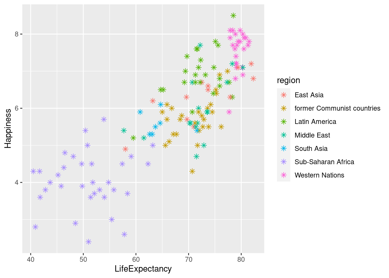
Typically, the color aesthetic changes the outline of a geom and the fill aesthetic changes the inside. geom_point() is an exception: you use color (not fill) for the point color. However, some shapes have special behavior.
“stroke =” is used for the thickness of the outline.
The default geom_point() uses shape = 19: a solid circle. An alternative is shape = 21: a circle that allow you to use both fill for the inside and color for the outline. This is lets you to map two aesthetics to each point.
#Using region for color and footprint for fill lets us see two different categorical variables on the scatter plot.

ggplot(happyplanet, aes(LifeExpectancy, Happiness, color = region, fill = footprint)) + geom_point(shape = 21, size = 5, alpha = .8, stroke = 2)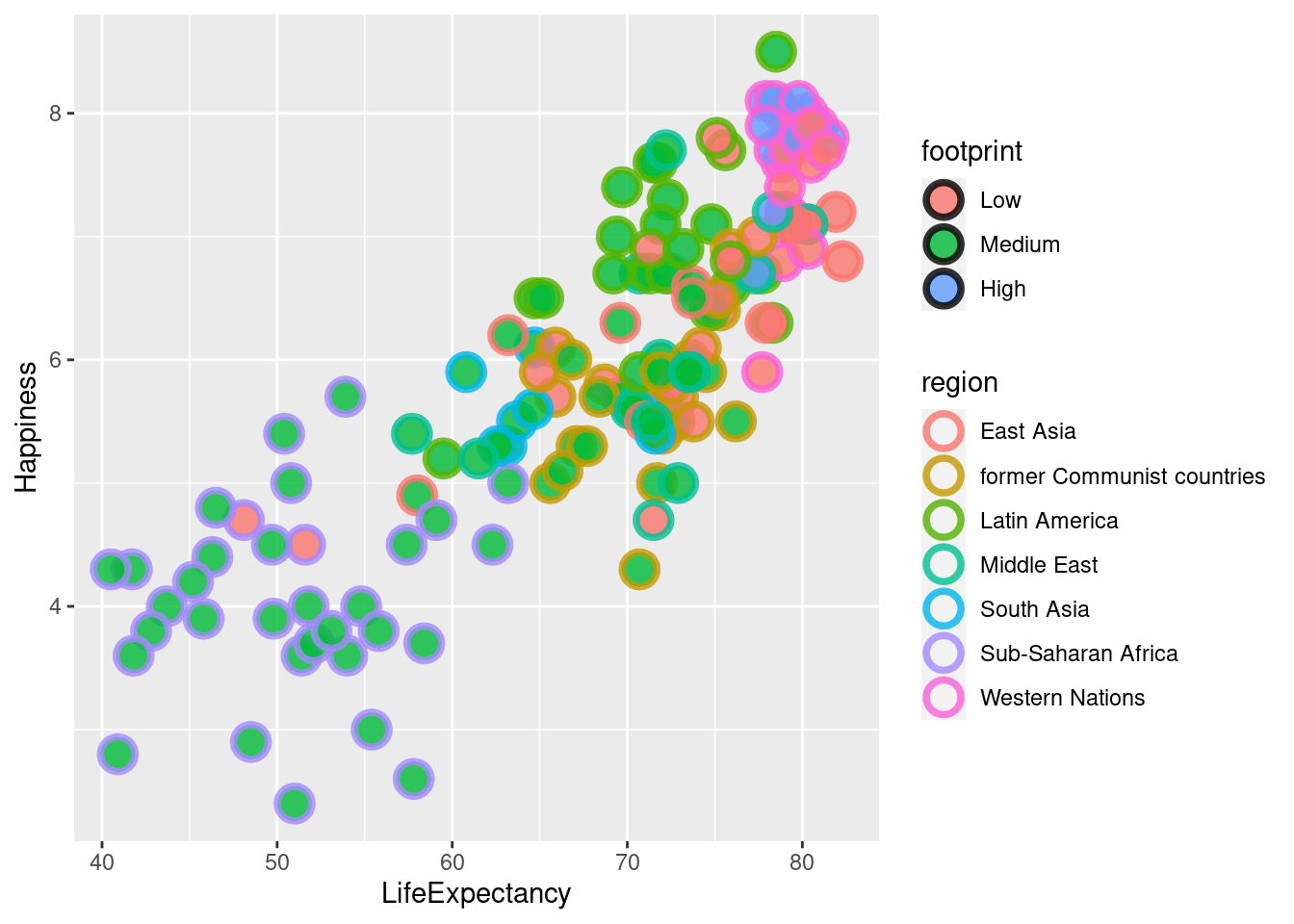
lifexp_happy + geom_point(aes(color = GDPperCapita * Population))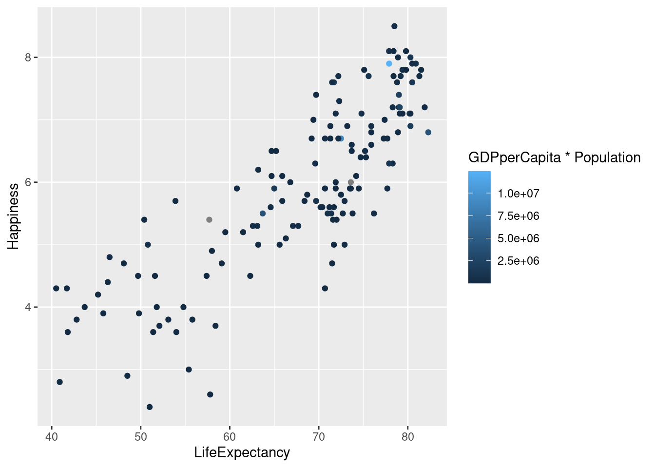
geom_text()? Don’t be afraid to try different versions of the graph in order to find the one that best displays the information. In the graphs below, using color to map ecological footprint shows the relationships between the variables most clearly.
#Mapping ecological footprint to text.
lifexp_happy + geom_text(aes(label = footprint))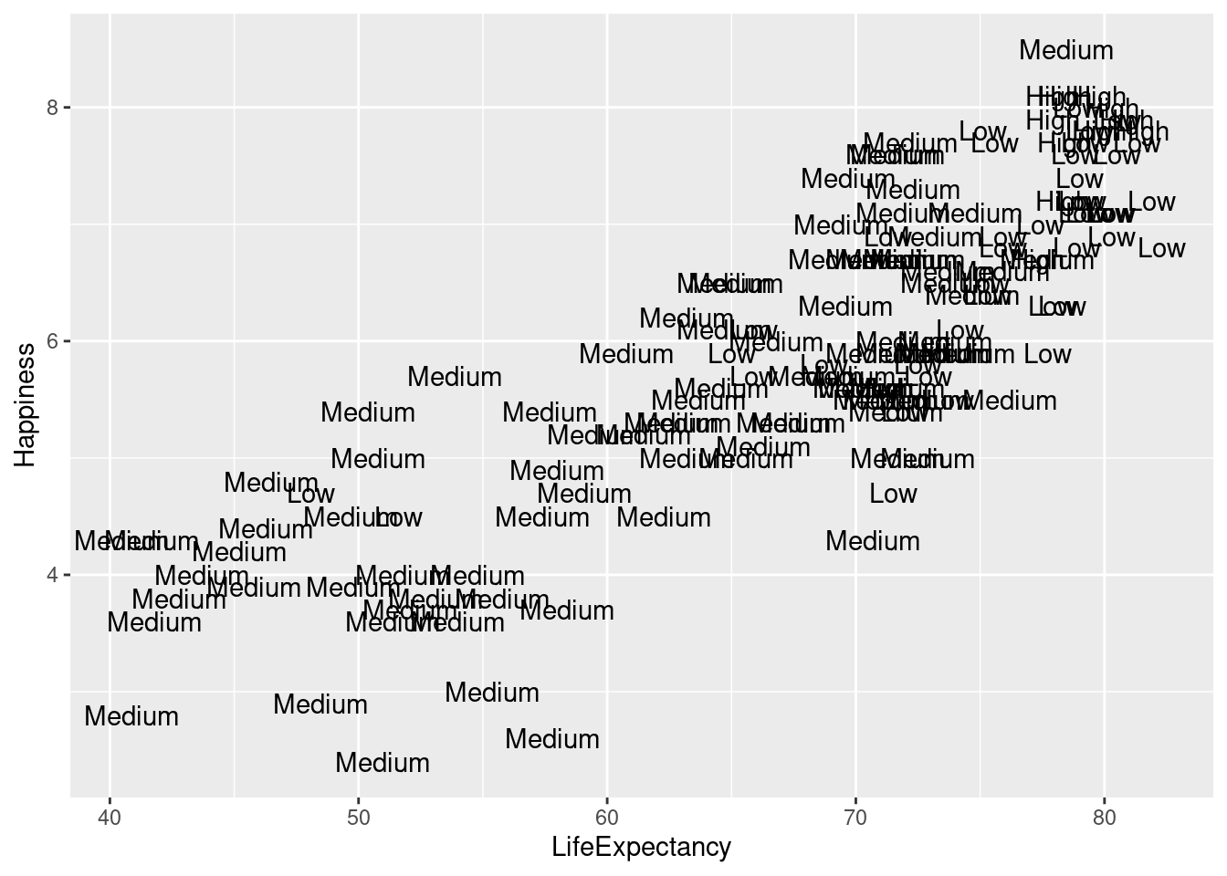
#Mapping ecological footprint to color.
lifexp_happy + geom_point(aes(color = footprint))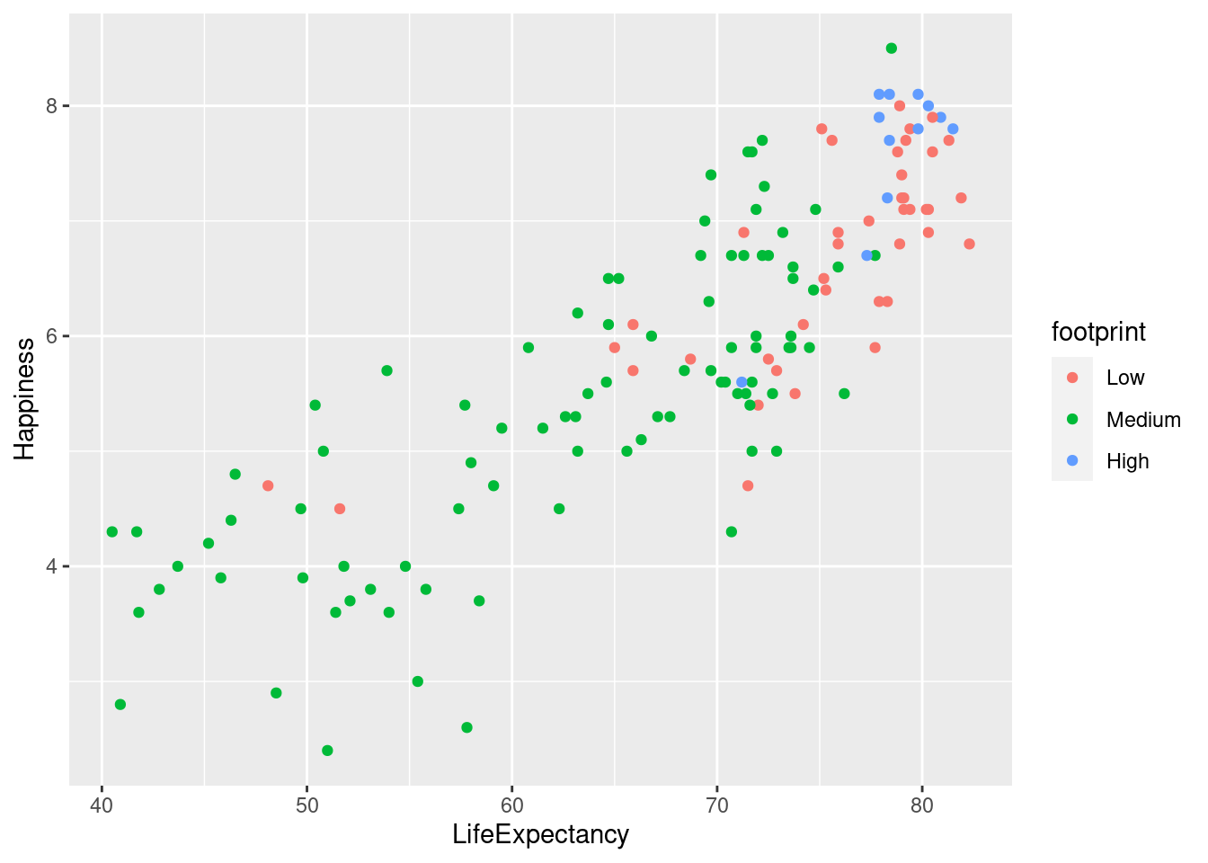
#Mapping ecological footprint to size.
lifexp_happy + geom_point(aes(size = footprint))
## Warning: Using size for a discrete variable is not advised.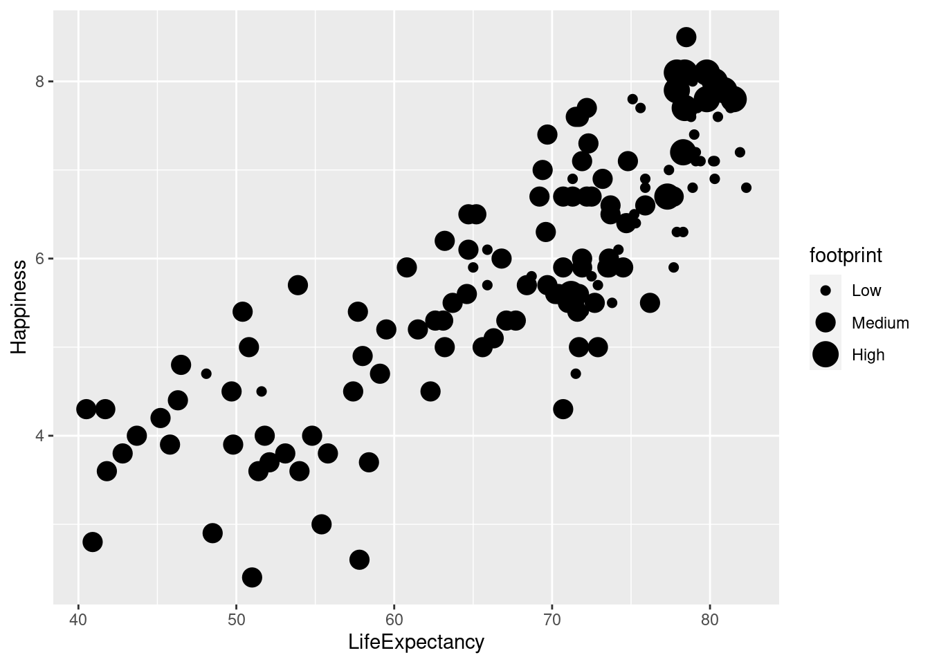
You can specify colors in R using hex codes: a hash followed by two hexadecimal numbers each for red, green, and blue (“#RRGGBB”). Hexadecimal is base-16 counting. You have 0 to 9, and A representing 10 up to F representing 15. Pairs of hexadecimal numbers give you a range from 0 to 255. “#000000” is “black” (no color), “#FFFFFF” means “white”, and `“#00FFFF” is cyan (mixed green and blue).
prettypink <- "#FFAACC"
sagegreen <- "#66CC99"
lightpurp <- "#9999FF"

lifexp_happy + geom_point(color = lightpurp, fill = prettypink, shape = 21, size = 4)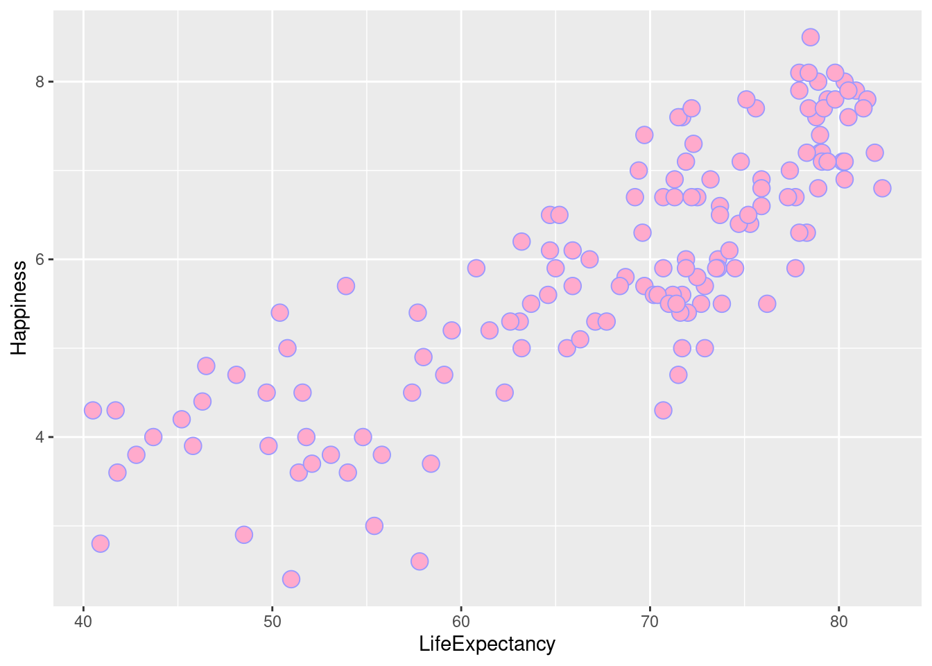
geom_text() to label points by their row names. The happy planet index uses numbers for their row names so it isn’t very helpful to use this function.
lifexp_happy + geom_text(label = rownames(happyplanet))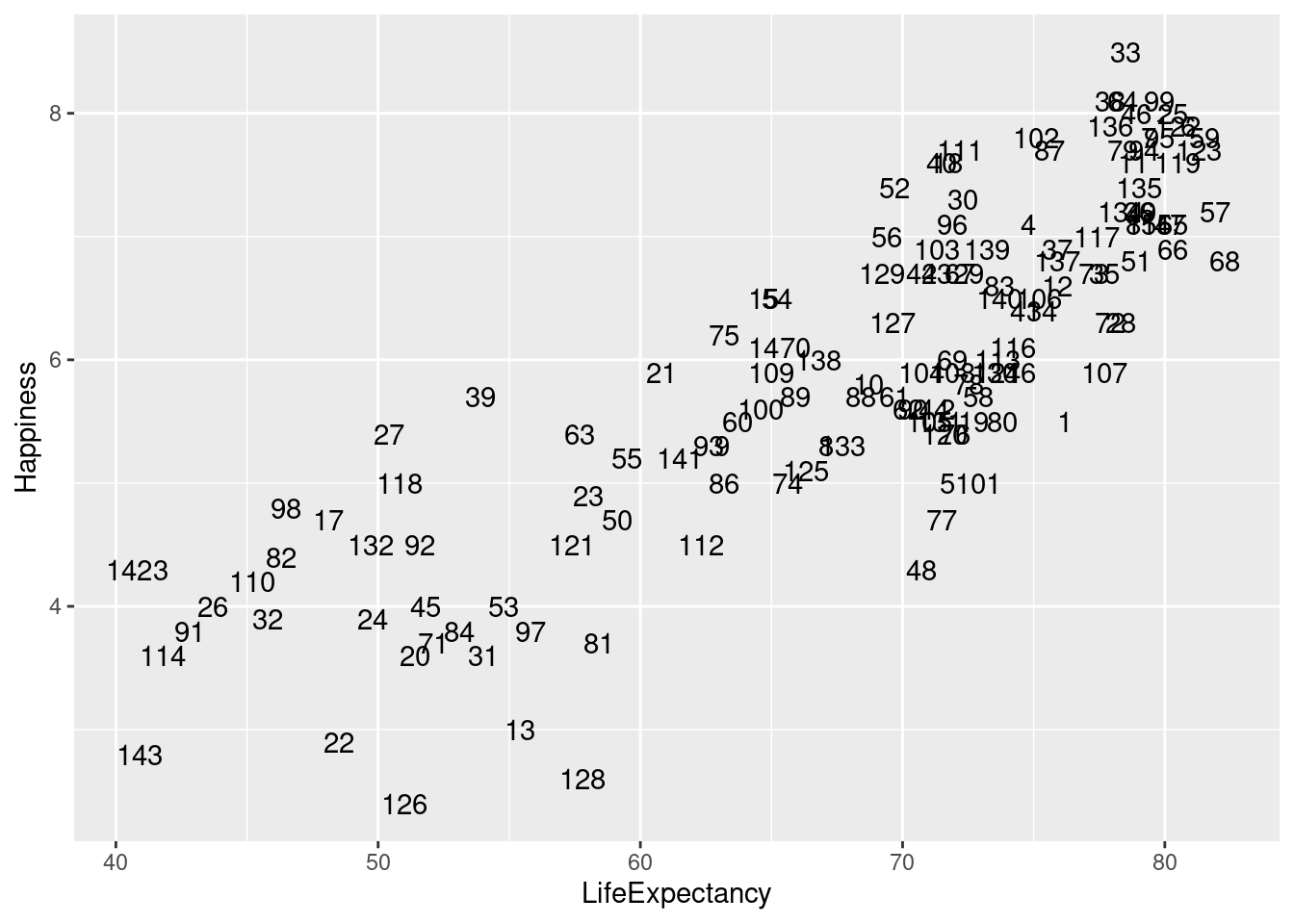
4.2.2 Modifying Aesthetics
Labs() sets the x- and y-axis labels. It takes strings for each argument.Alternatively you can use xlab() and ylab().
scale_fill_manual() defines properties of the color scale (i.e. axis). The first argument sets the legend title. Values is a named vector of colors to use.
xlim() and ylim() set the x and y limits, respectively.
#Creating vector with colors to use for bar graph.
palette <- c(Low = "#FFCCCC", Medium = "#FF6666", High = "#FF0000")

#Define labels and add color scale using vector we just created
ggplot(happyplanet, aes(region, fill = footprint)) +
  geom_bar() +
  labs(x = "Region", y = "Count") +
  scale_fill_manual("Ecological Footprint", values = palette)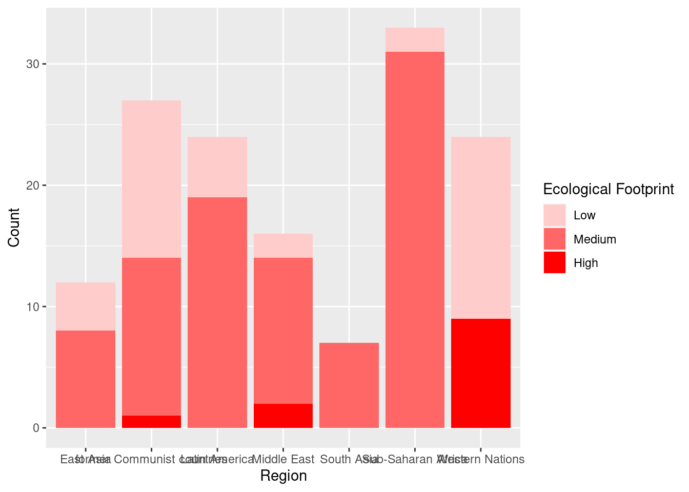
#Setting x and y limits (usually the default limits are best).
lifexp_happy + geom_point() + xlim(30, 90) + ylim(0, 10)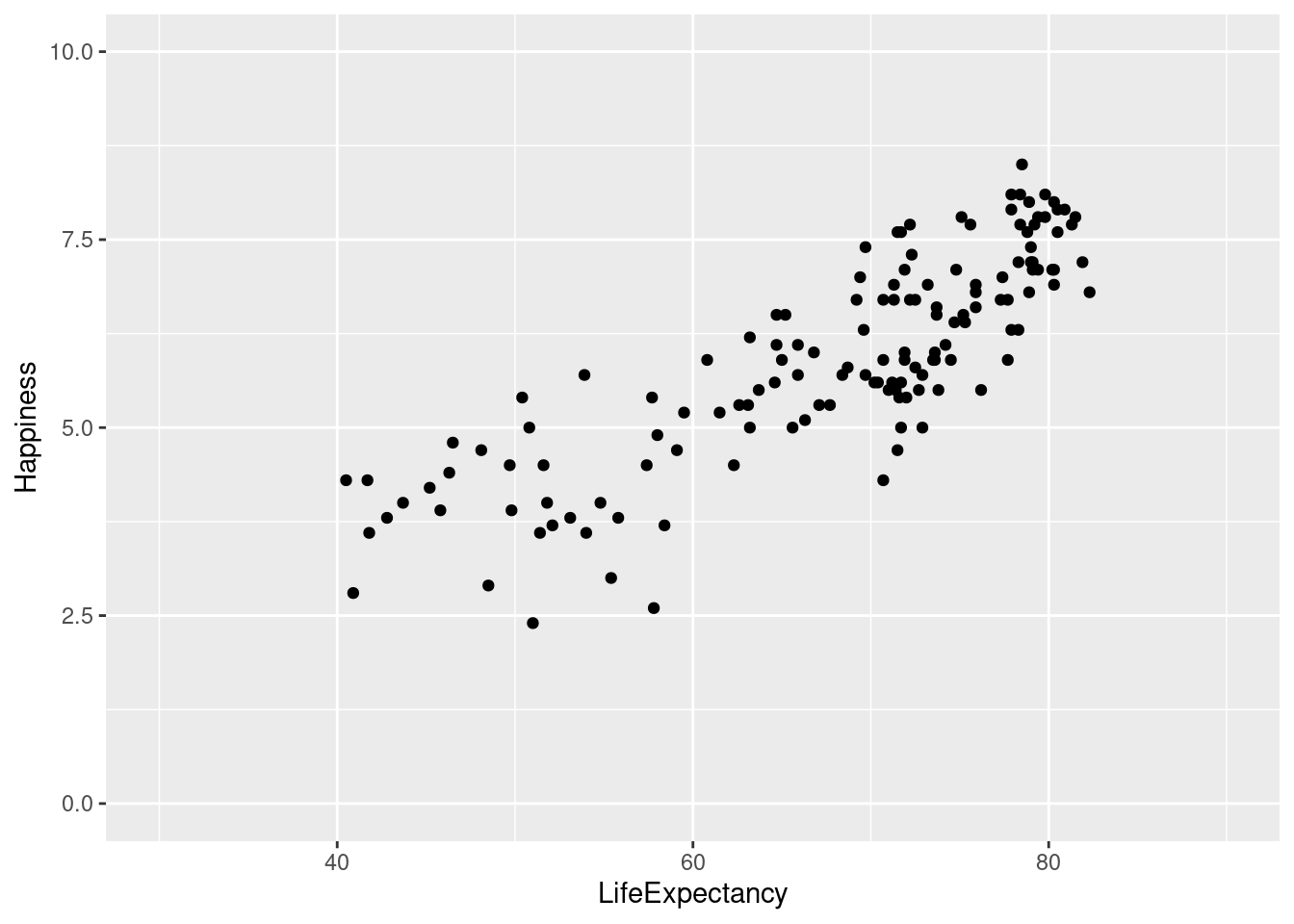
4.2.2.1 Position Modifications
A common adjustment or modification for a graph is the position. Position specifies how ggplot will adjust for overlapping bars or points on a single layer. For example, we have identity, dodge, stack, fill, jitter, jitterdodge, and nudge. The default is “identity.”
#To modify the position of the bars so they are next to each other rather than stacked, we can add an argument to `geom_bar()`: "position = 'dodge'".

ggplot(happyplanet, aes(region, fill = footprint)) +
  geom_bar(position = 'dodge') +
  labs(x = "Region", y = "Count") +
  scale_fill_manual("Ecological Footprint", values = palette)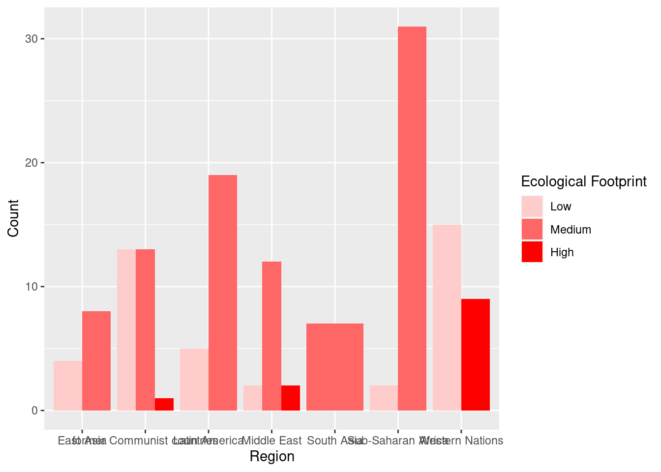
When there is too much overplotting to distinguish individual points, we need to add some random noise on both the x and y axes to see regions of high density - which is referred to as “jittering”. We can either add it as a “position = jitter” argument or as a function, position_jitter(), which allows us to set specific arguments for the position, such as the width, which defines how much random noise should be added, and it allows us to use this parameter throughout our plotting functions so that we can maintain consistency across plots.
#Regular scatterplot
lifexp_happy + geom_point()
#Defining position_jitter vector
pos1 <- position_jitter(.8, .8, seed = 200)

#Adding position_jitter vector that adds noise
lifexp_happy + geom_point(position = pos1)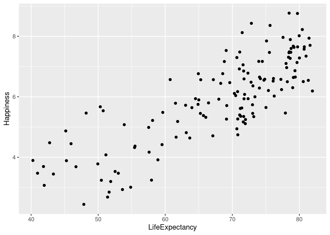
4.3 Geometries
4.3.1 Scatter plots
Scatter plots (using geom_point()) are intuitive, easily understood, and very common, but we must always consider overplotting, particularly in the following four situations:
- Large datasets
- Aligned values on a single axis
- Low-precision data
- Integer data
With datasets where there are aligned values on a single axis, we can use jittering. Typically this is used when one variable is categorical and one is continuous.
#Graph plotting region v. happiness without jittering
ggplot(happyplanet, aes(region, Happiness, color = footprint)) + geom_point()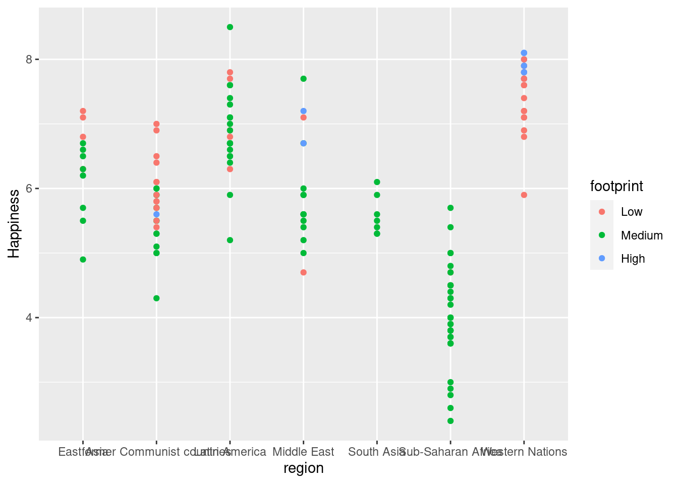
#Graph plotting region v. happiness with position_jitter
ggplot(happyplanet, aes(region, Happiness, color = footprint)) + geom_point(position = position_jitter(width = .3))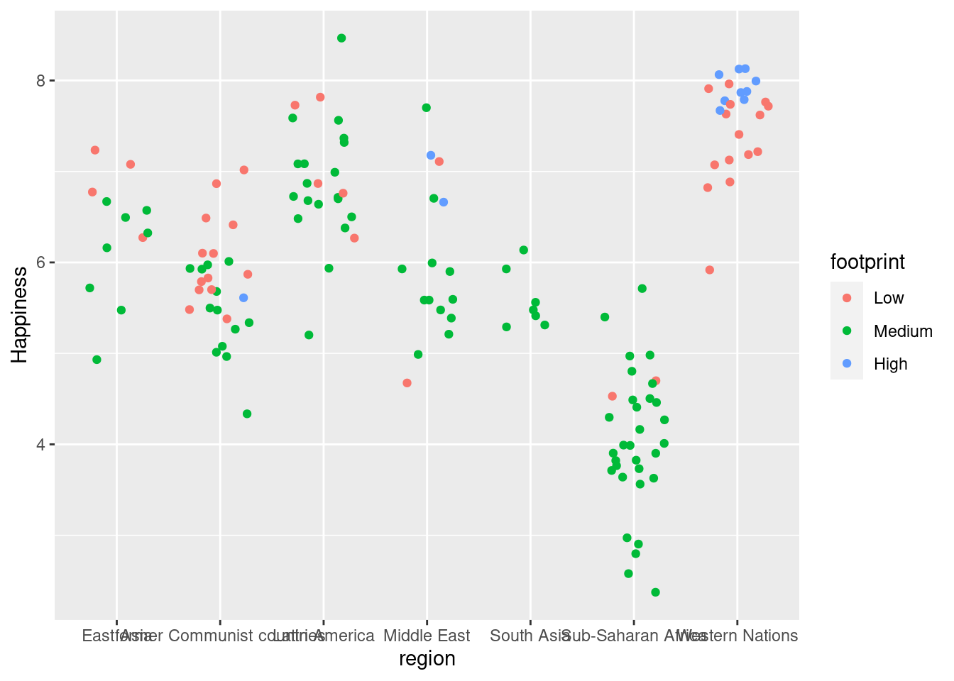
#Graph plotting region v. happiness with position_jitterdodge (separates subgroups more)
ggplot(happyplanet, aes(region, Happiness, color = footprint)) + geom_point(position = position_jitterdodge(jitter.width = 0.5, dodge.width = 0.5))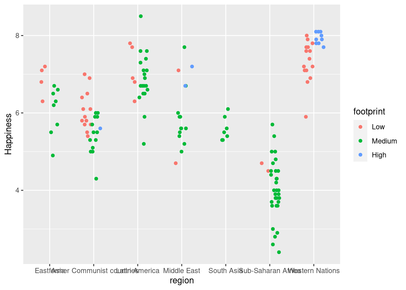
Low precision data results from low-resolution measurements like in the iris dataset, which is measured to 1mm precision (see viewer). It’s similar to case 2, but in this case we can jitter on both the x and y axis.
Note that jitter can be a geom itself (i.e. geom_jitter()), an argument in geom_point() (i.e. position = “jitter”), or a position function, (i.e. position_jitter()).
Let’s take a look at the last case of dealing with overplotting:
Integer data This can be type integer (i.e. 1 ,2, 3…) or categorical (i.e. class factor) variables. factor is just a special class of type integer.
You’ll typically have a small, defined number of intersections between two variables, which is similar to case 3, but you may miss it if you don’t realize that integer and factor data are the same as low precision data.
#Using a jitter layer instead of point to better view data that uses integers on on of the axes.
ggplot(Vocab, aes(education, vocabulary)) +
  geom_jitter(alpha = 0.2, shape = 1)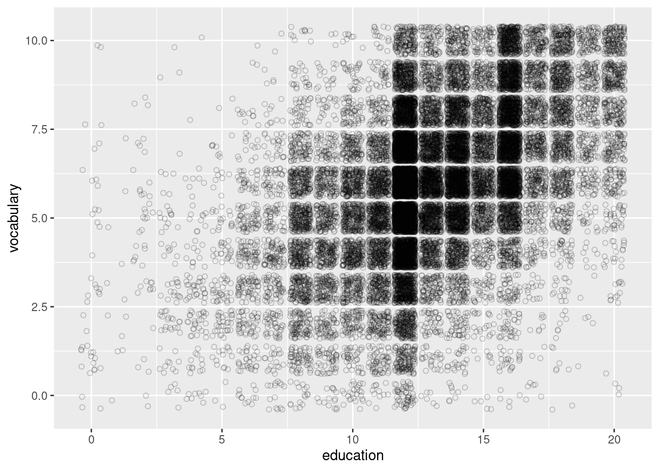
4.3.2 Histograms
Recall that histograms cut up a continuous variable into discrete bins and, by default, maps the internally calculated count variable (the number of observations in each bin) onto the y aesthetic. An internal variable called density can be accessed by using the .. notation, i.e. ..density… Plotting this variable will show the relative frequency, which is the height times the width of each bin.
#Histogram with count on y-axis
ggplot(happyplanet, aes(Happiness)) + geom_histogram(binwidth = .5, fill = prettypink, color = "white")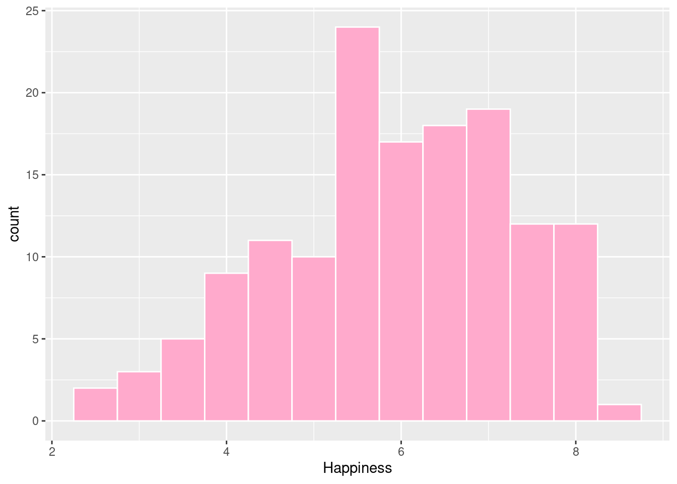
#Histogram with density on y-axis
ggplot(happyplanet, aes(Happiness, ..density..)) + geom_histogram(binwidth = .5, fill = prettypink, color = "white")
## Warning: The dot-dot notation (`..density..`) was deprecated in ggplot2 3.4.0.
## ℹ Please use `after_stat(density)` instead.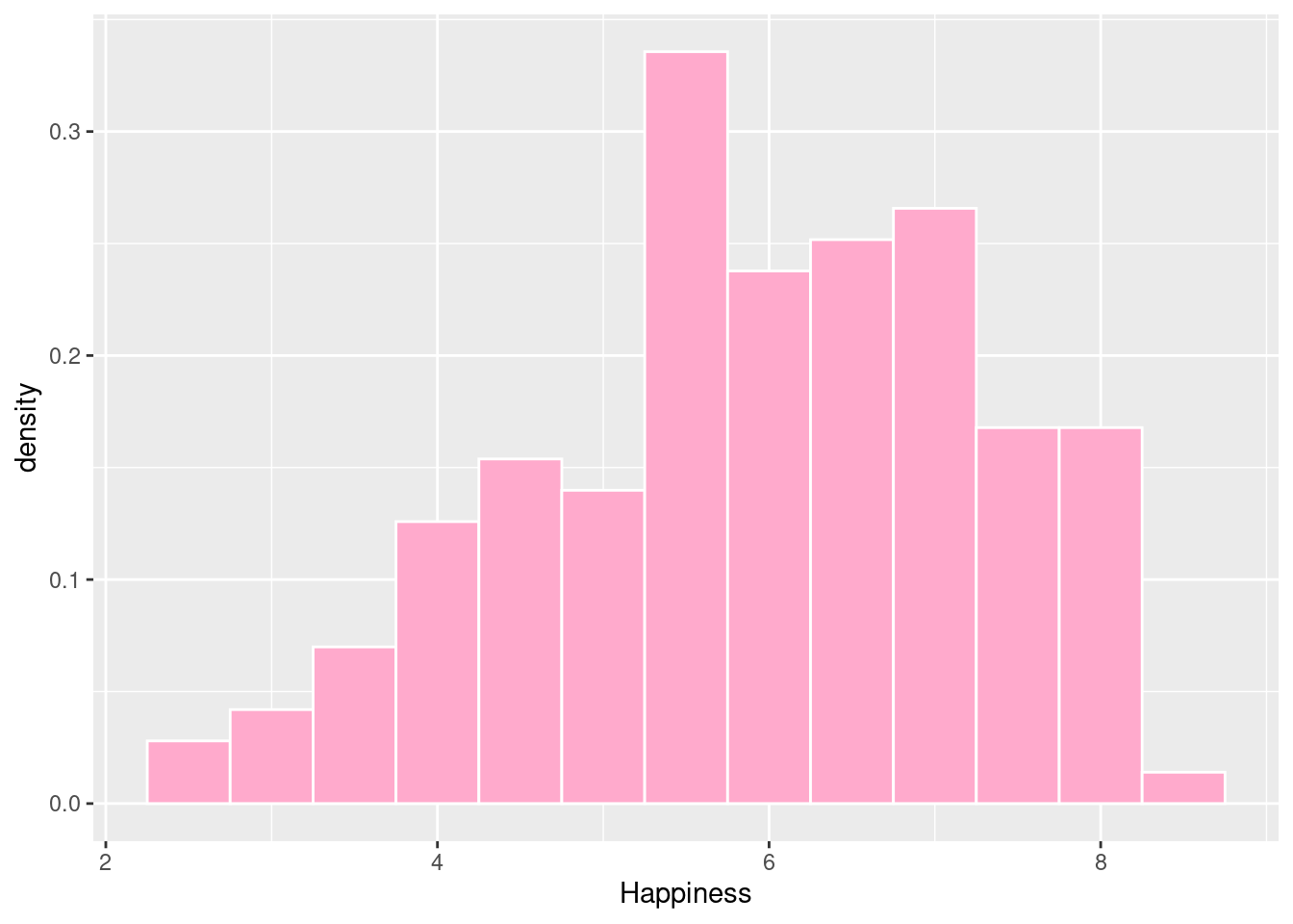
Here, we’ll examine the various ways of applying positions to histograms. geom_histogram(), a special case of geom_bar(), has a position argument that can take on the following values:
- stack (the default): Bars for different groups are stacked on top of each other.
- dodge: Bars for different groups are placed side by side.
- fill: Bars for different groups are shown as proportions.
- identity: Plot the values as they appear in the dataset.
#stack (default)
ggplot(happyplanet, aes(Happiness, fill = footprint)) + geom_histogram(binwidth = .5)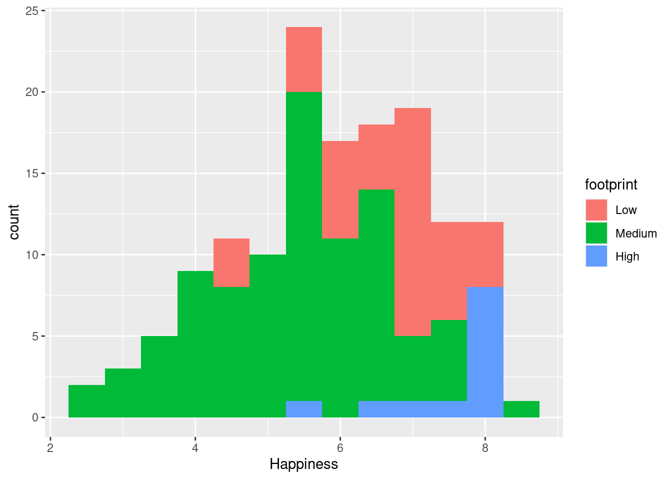
#dodge
ggplot(happyplanet, aes(Happiness, fill = footprint)) + geom_histogram(binwidth = .5, position = 'dodge')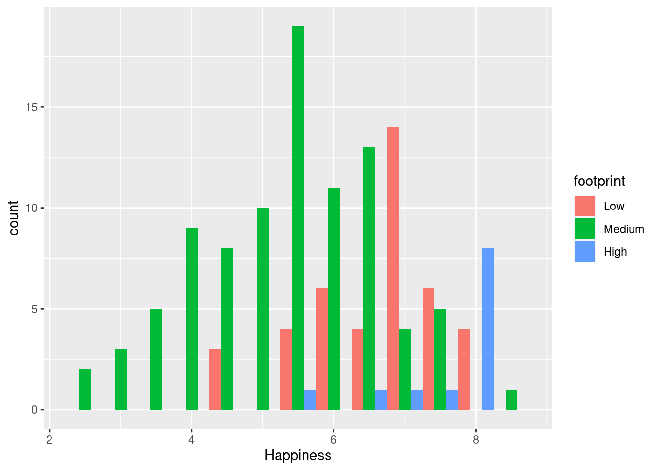
#fill
ggplot(happyplanet, aes(Happiness, fill = footprint)) + geom_histogram(binwidth = .5, position = 'fill')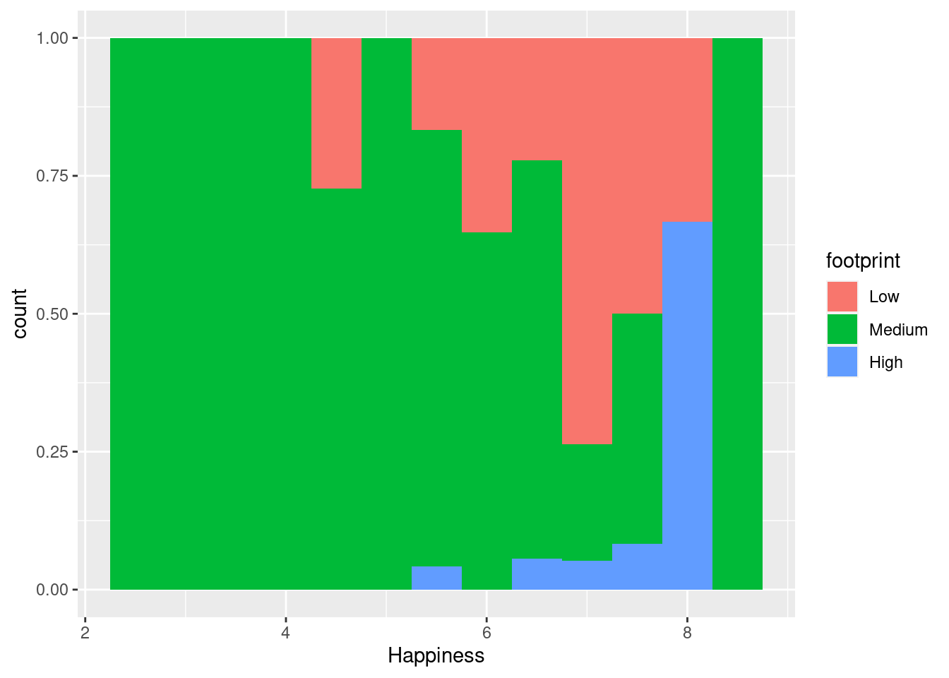
#identity
ggplot(happyplanet, aes(Happiness, fill = footprint)) + geom_histogram(binwidth = .5, position = 'identity', alpha = .4)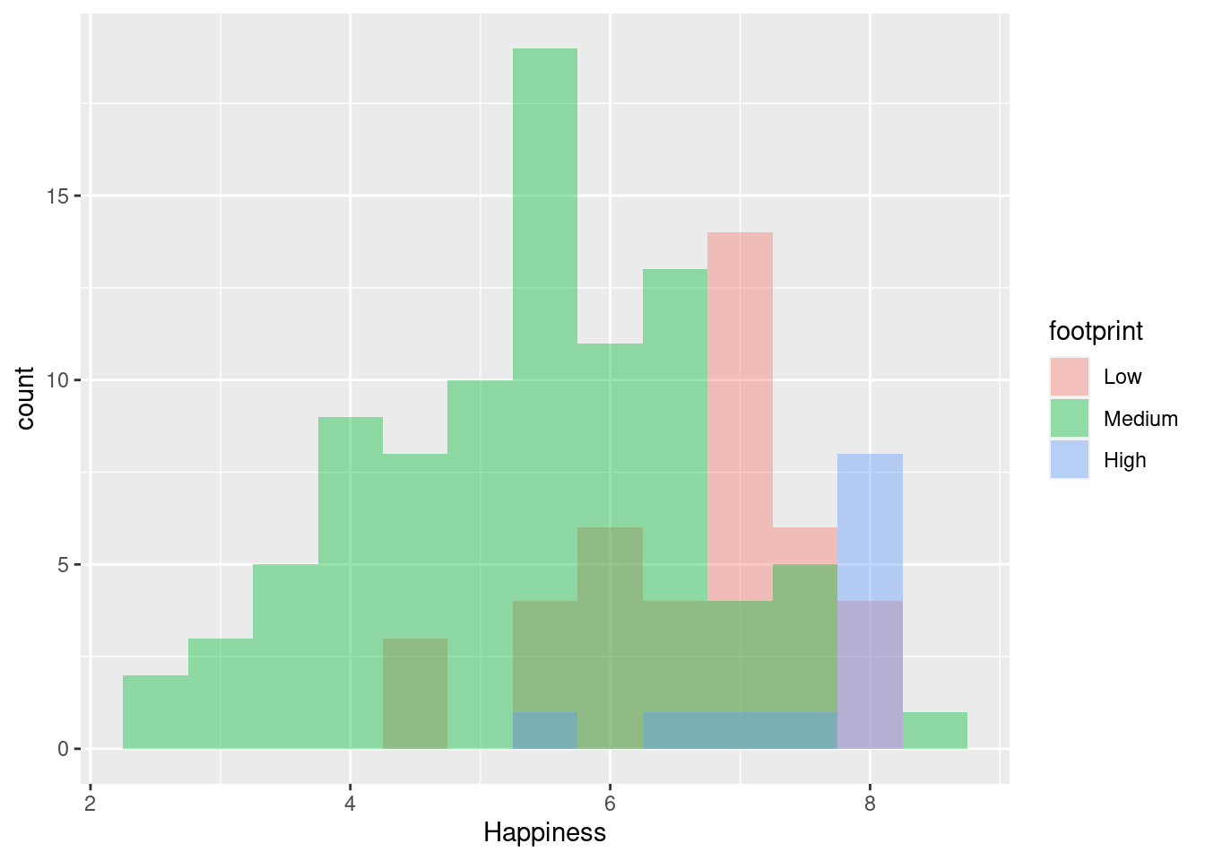
4.3.3 Bar Plots
Classic bar plots refer to a categorical X-axis. Here we need to use either geom_bar() or geom_col(). geom_bar() will count the number of cases in each category of the variable mapped to the x-axis, whereas geom_col() will just plot the actual value it finds in the data set.
Let’s see how the position argument changes geom_bar().
We have three position options:
- stack: The default
- dodge: Preferred
- fill: To show proportions
**note that the function geom_col() is just geom_bar() where both the position and stat arguments are set to “identity”. It is used when we want the heights of the bars to represent the exact values in the data.
#stack (default)
ggplot(happyplanet, aes(region, fill = footprint)) + geom_bar()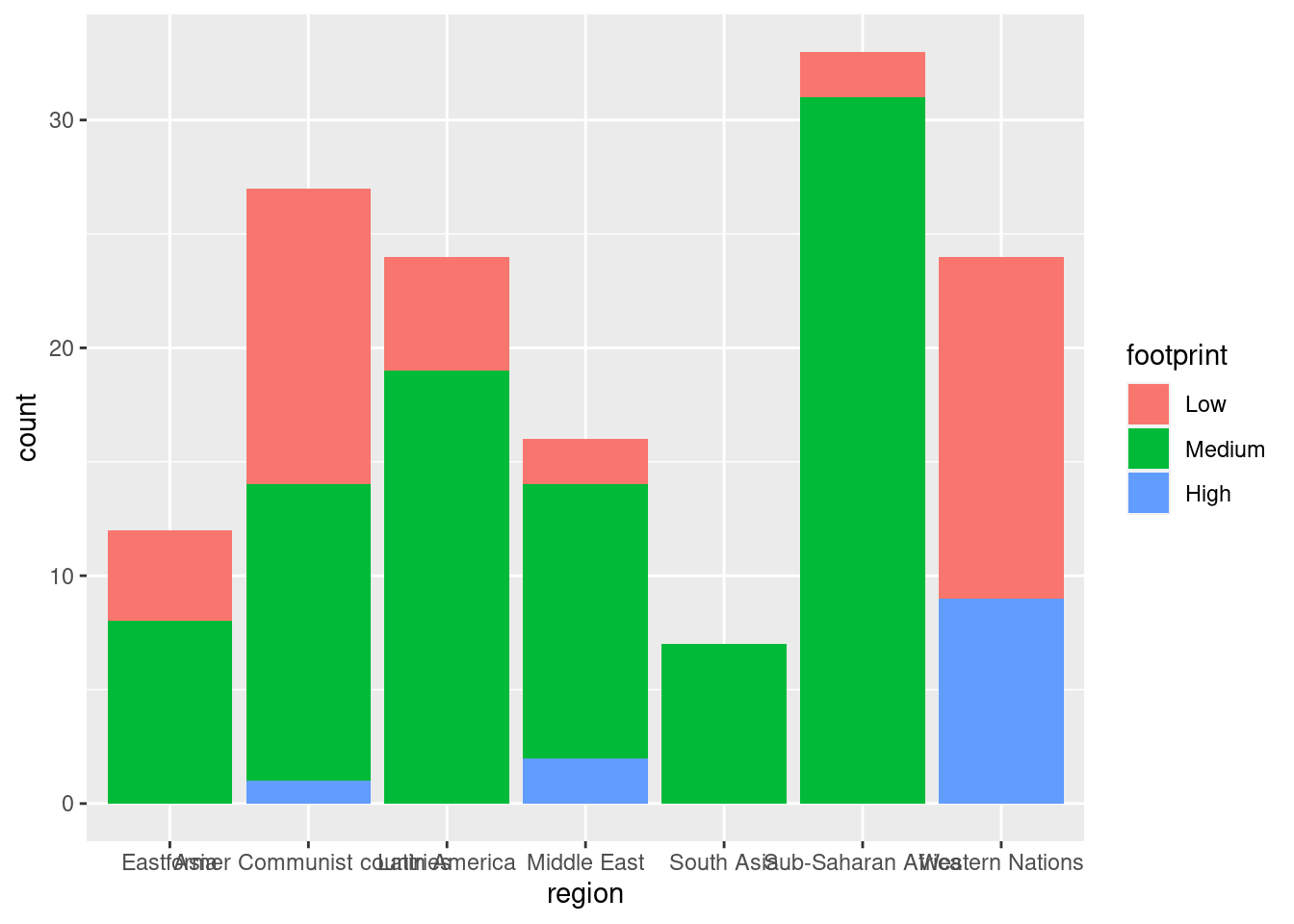
#dodge
ggplot(happyplanet, aes(region, fill = footprint)) + geom_bar(position = 'dodge')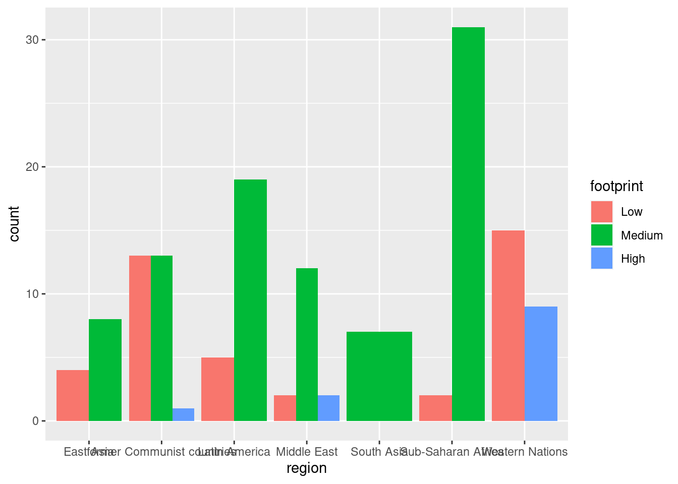
#alternate dodge setting width > 0
ggplot(happyplanet, aes(region, fill = footprint)) + geom_bar(position = position_dodge(width = 0.4), alpha = .5)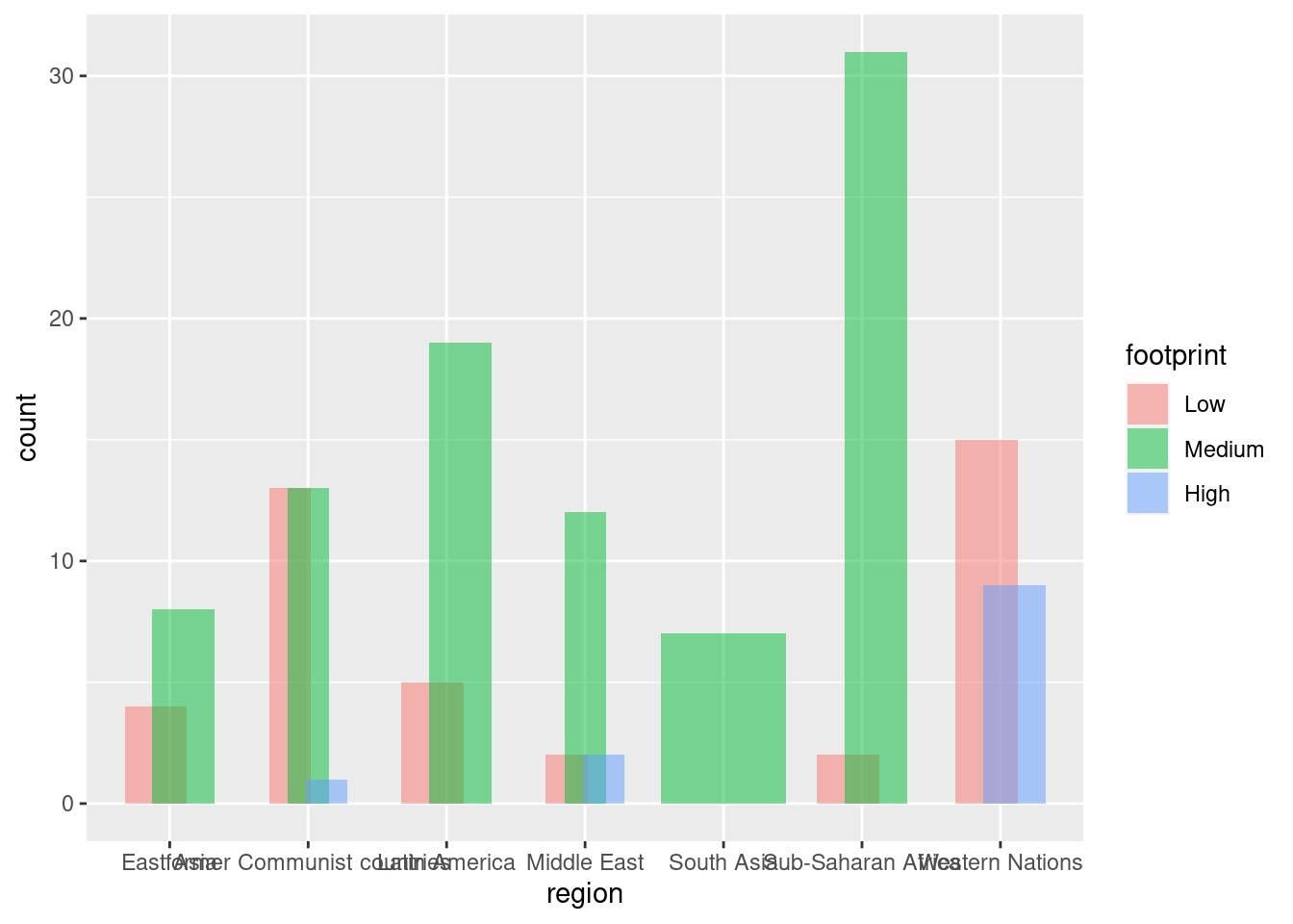
#fill
ggplot(happyplanet, aes(region, fill = footprint)) + geom_bar(position = 'fill')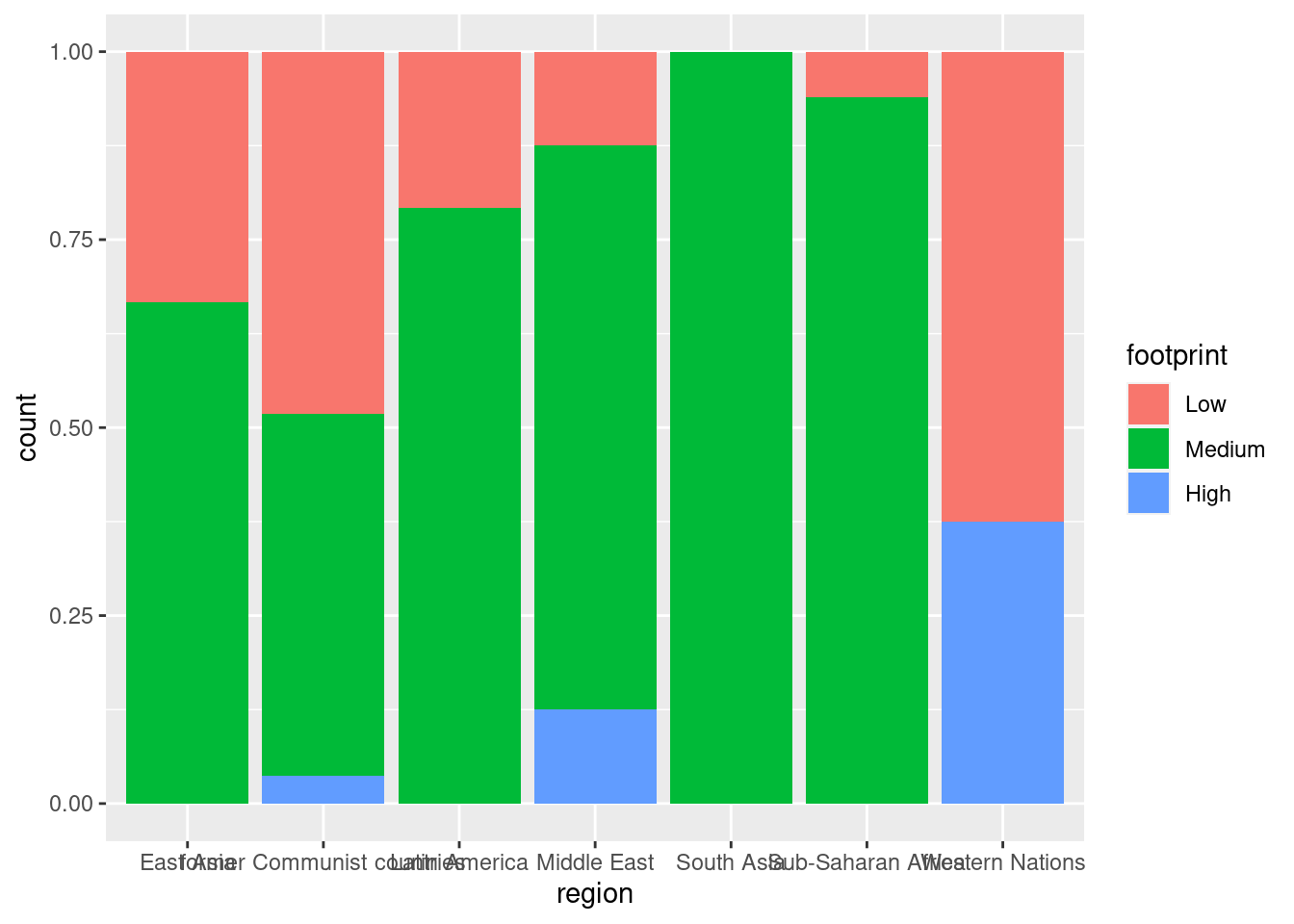
#fill with a sequential color palette
ggplot(happyplanet, aes(region, fill = footprint)) + geom_bar(position = 'fill') + scale_fill_brewer()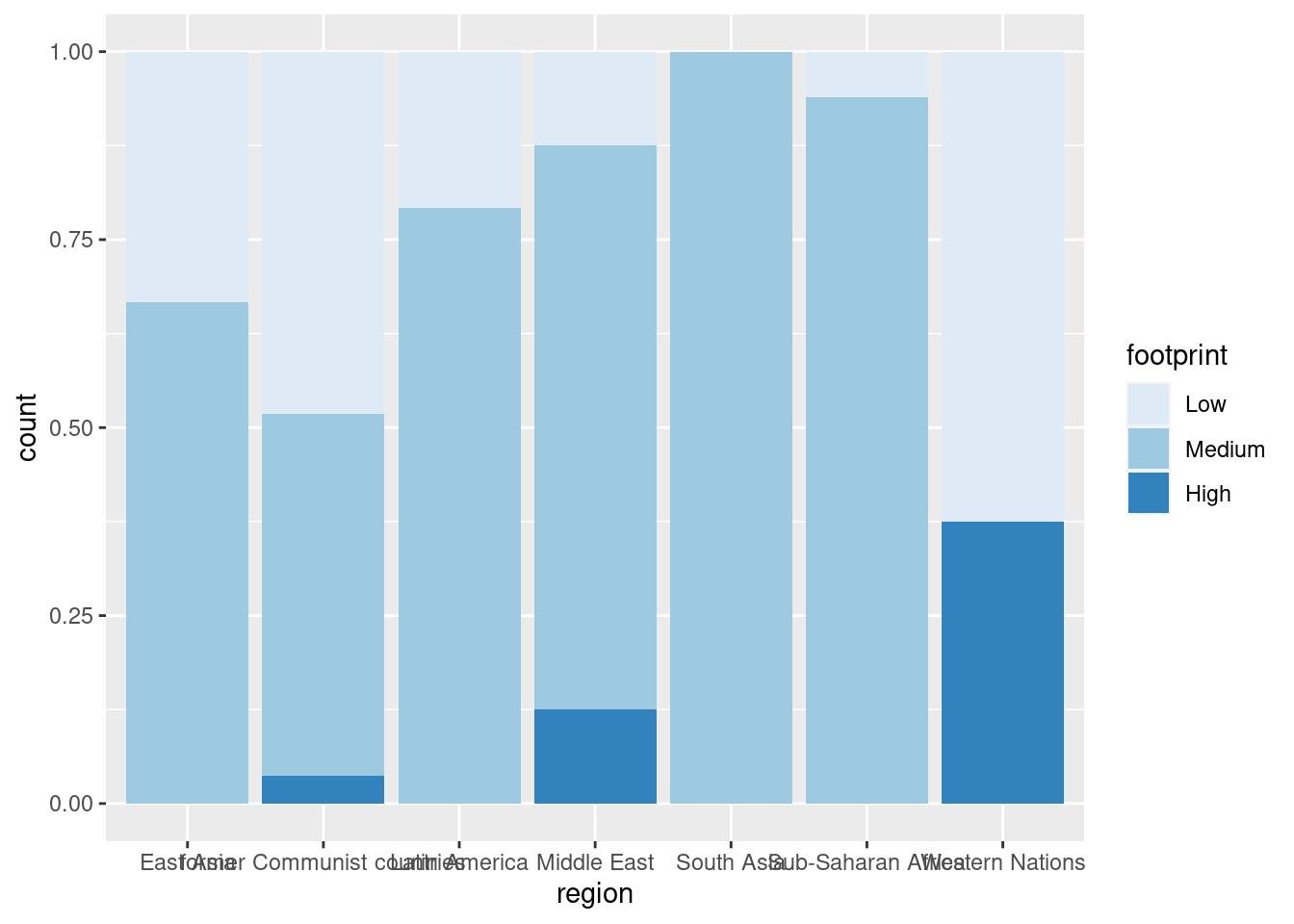
4.3.4 Line Plots
Here, we’ll use the economics dataset to make some line plots. The dataset contains a time series for unemployment and population statistics from the Federal Reserve Bank of St. Louis in the United States. The data is contained in the ggplot2 package.
#Plotting time v. unemployment rate
ggplot(economics, aes(date, unemploy)) +
  geom_line()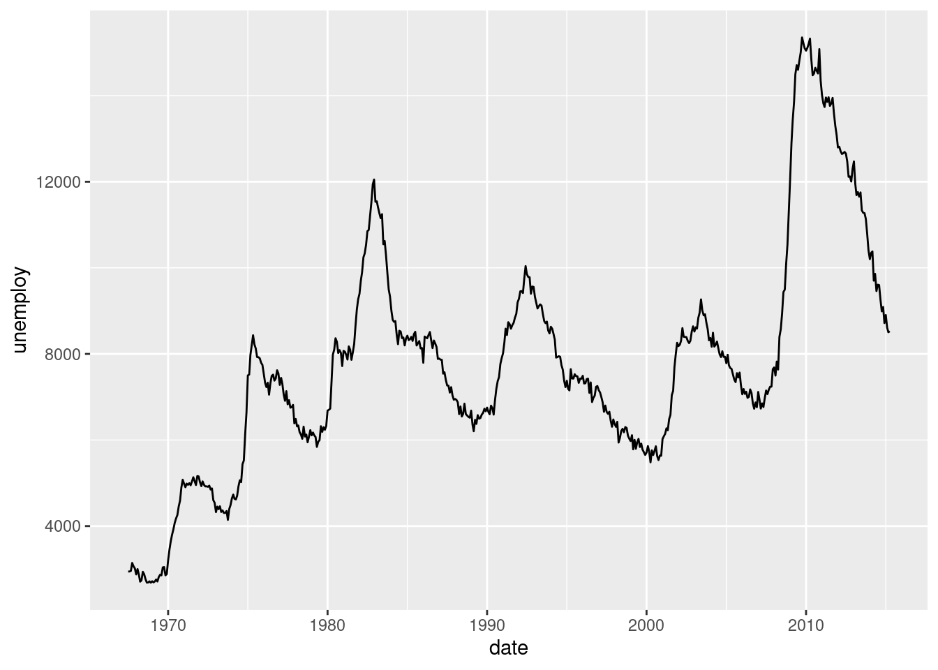
#Plotting time v. proportion of population that is unemployed
ggplot(economics, aes(date, unemploy/pop)) +
  geom_line()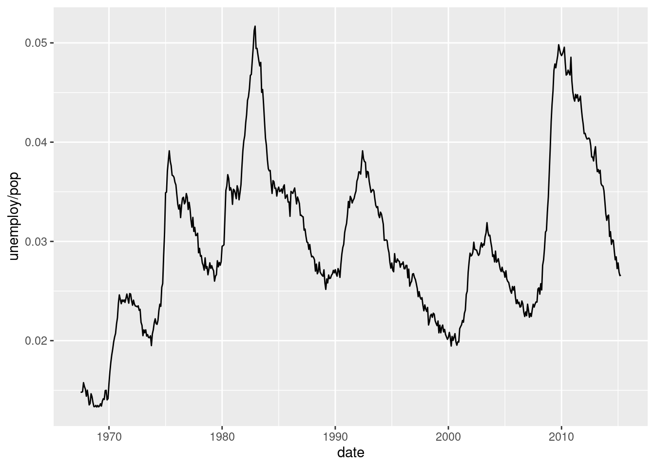
Multiple time series:
# Plot the Rainbow Salmon time series
ggplot(fish.species, aes(x = Year, y = Rainbow)) +
  geom_line()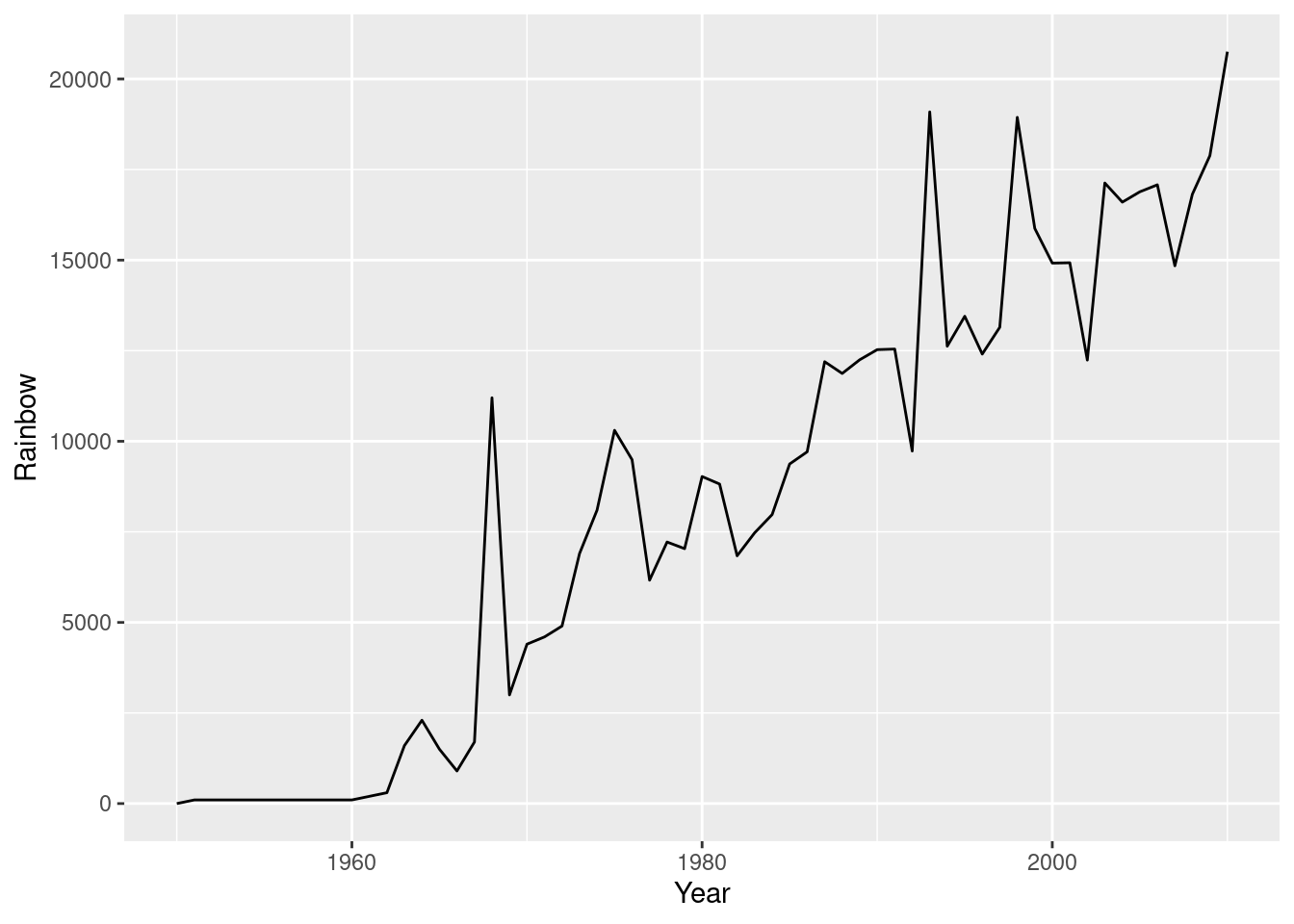
# Plot the Pink Salmon time series
ggplot(fish.species, aes(x = Year, y = Pink)) +
  geom_line()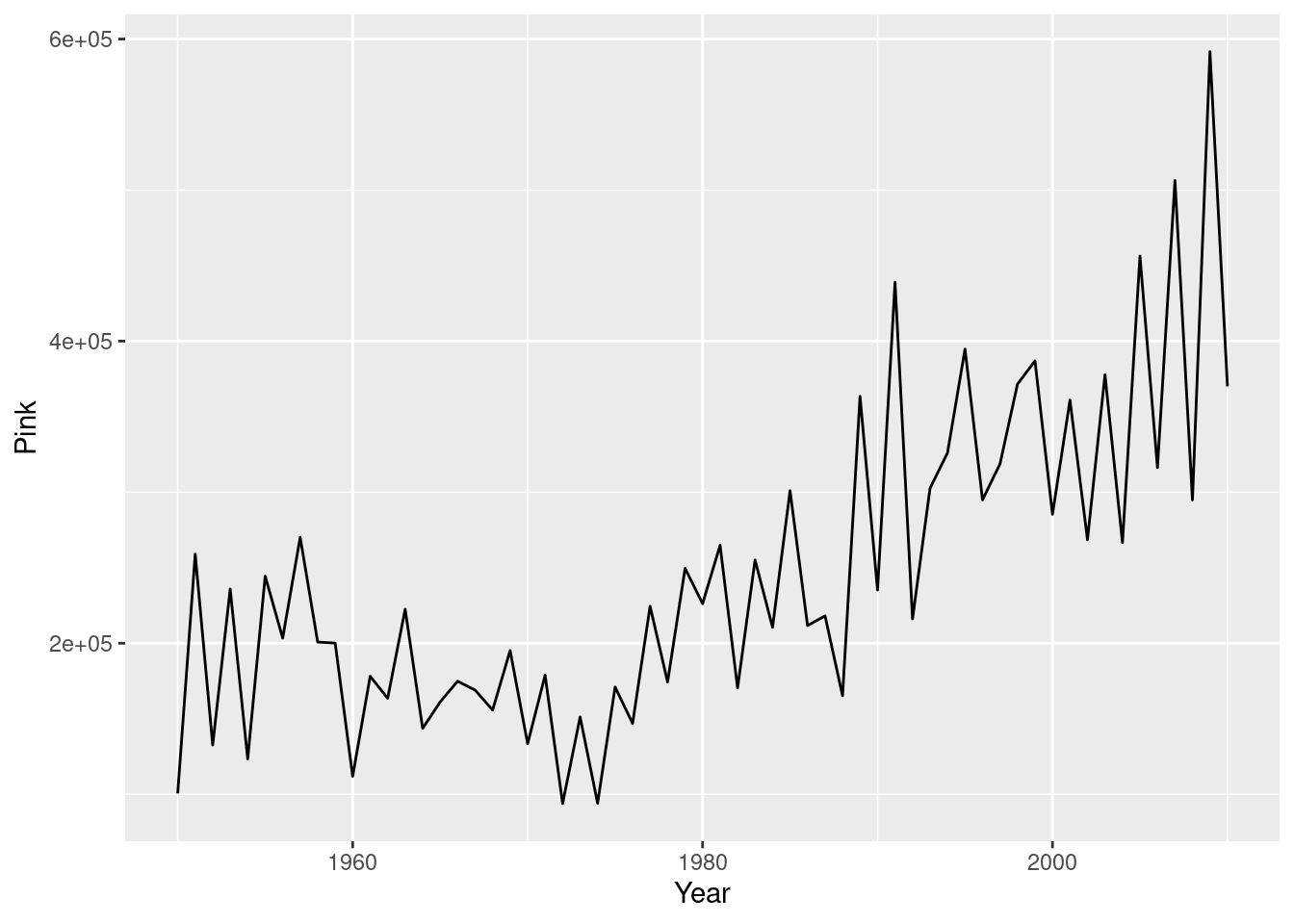
# Plot multiple time-series by grouping by species
ggplot(fish.tidy, aes(Year, Capture)) +
  geom_line(aes(group = Species))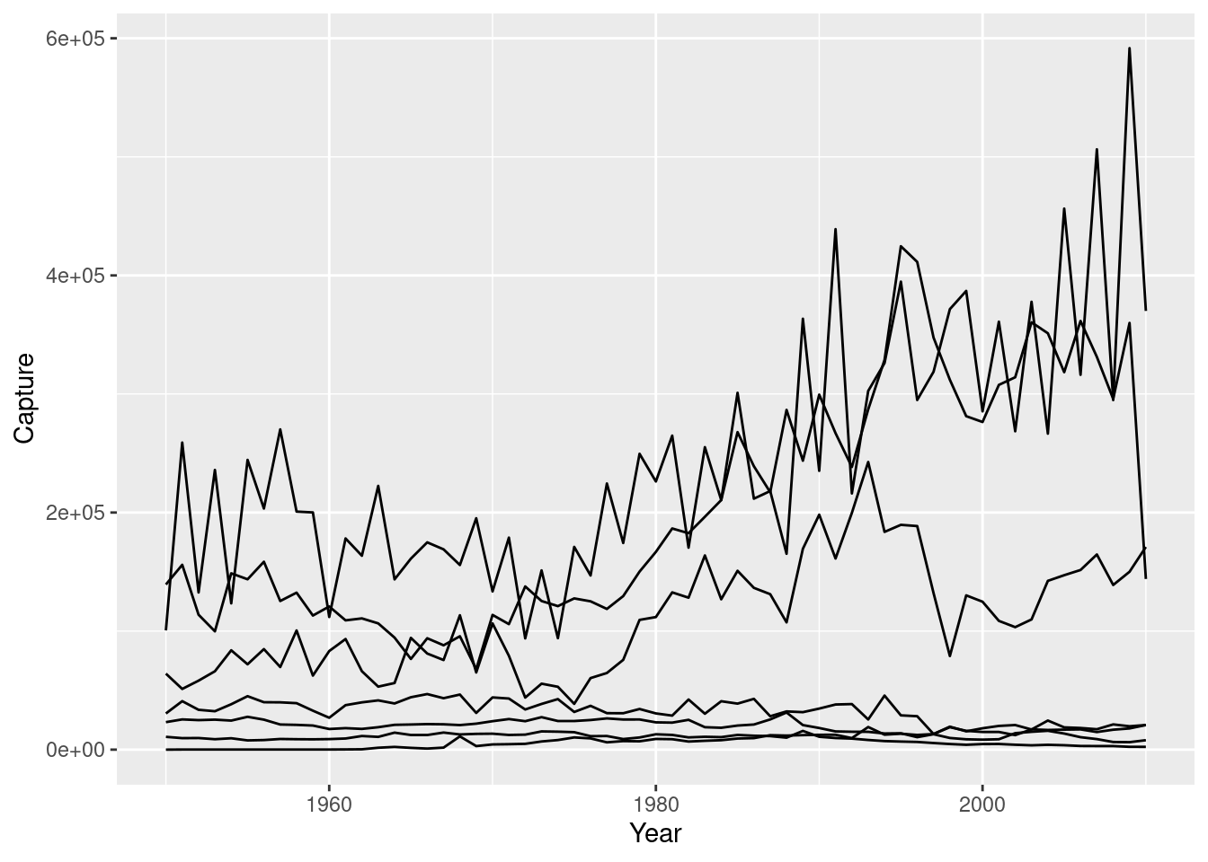
# Plot multiple time-series by coloring by species
ggplot(fish.tidy, aes(Year, Capture, color = Species)) +
  geom_line(aes(group = Species))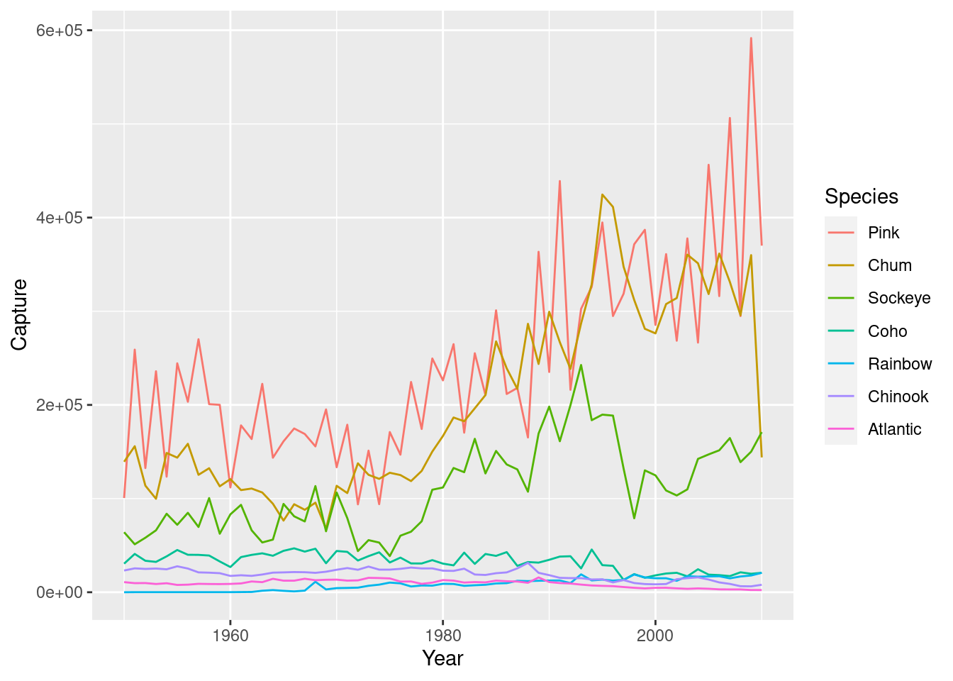
4.4 Themes
4.4.1 Stylistc Elements
To change stylistic elements of a plot, call theme() and set plot properties to a new value. For example, the following changes the legend position.
p + theme(legend.position = new_value)
Here, the new value can be
- “top”, “bottom”, “left”, or “right’”: place it at that side of the plot.
- “none”: don’t draw it.
- c(x, y): c(0, 0) means the bottom-left and c(1, 1) means the top-right.
lifexp_happy_plot <- lifexp_happy + geom_point(aes(color = region))

#Removing legend
lifexp_happy_plot + theme(legend.position = "none")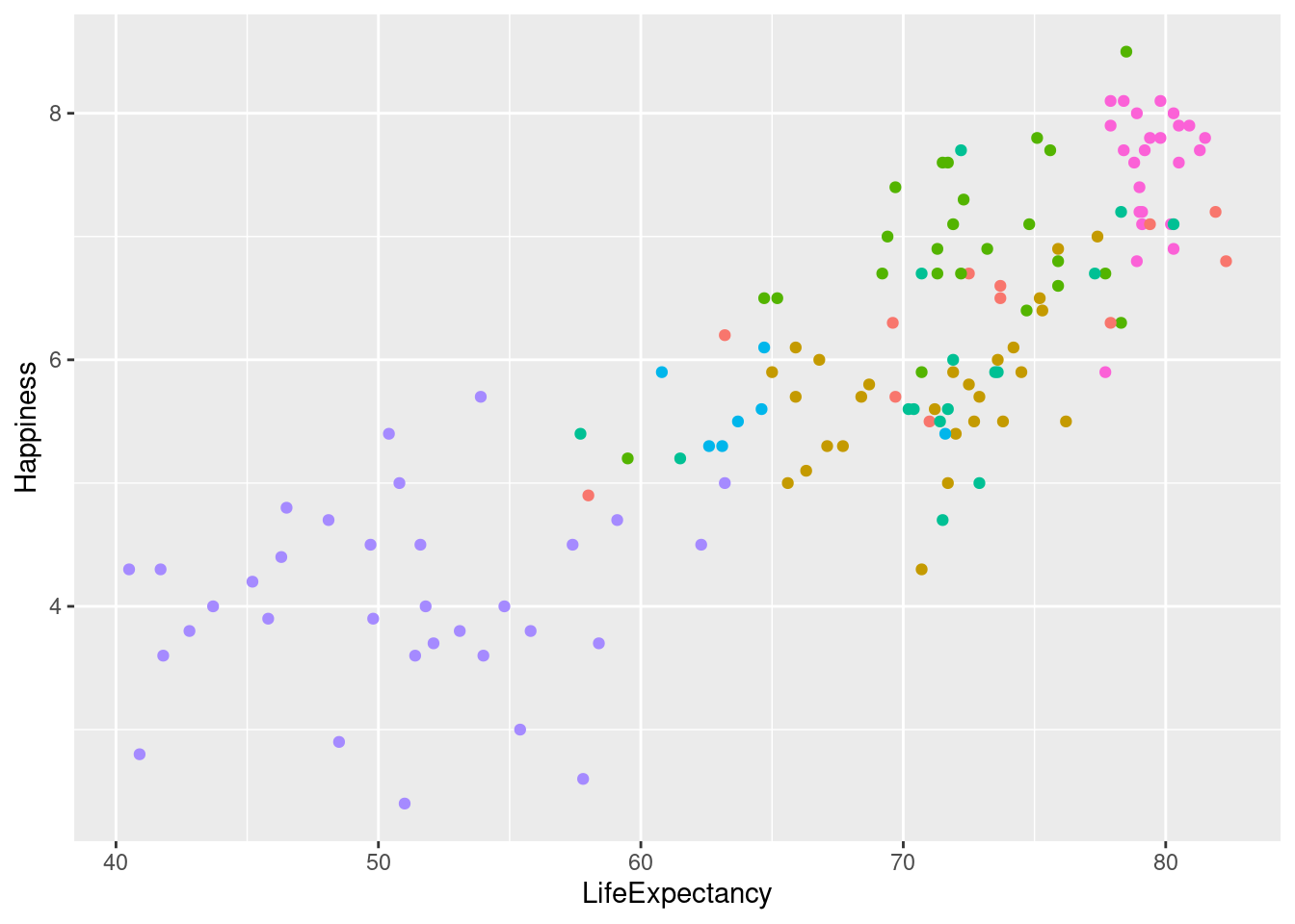
#Placing legend at the top
lifexp_happy_plot + theme(legend.position = "top")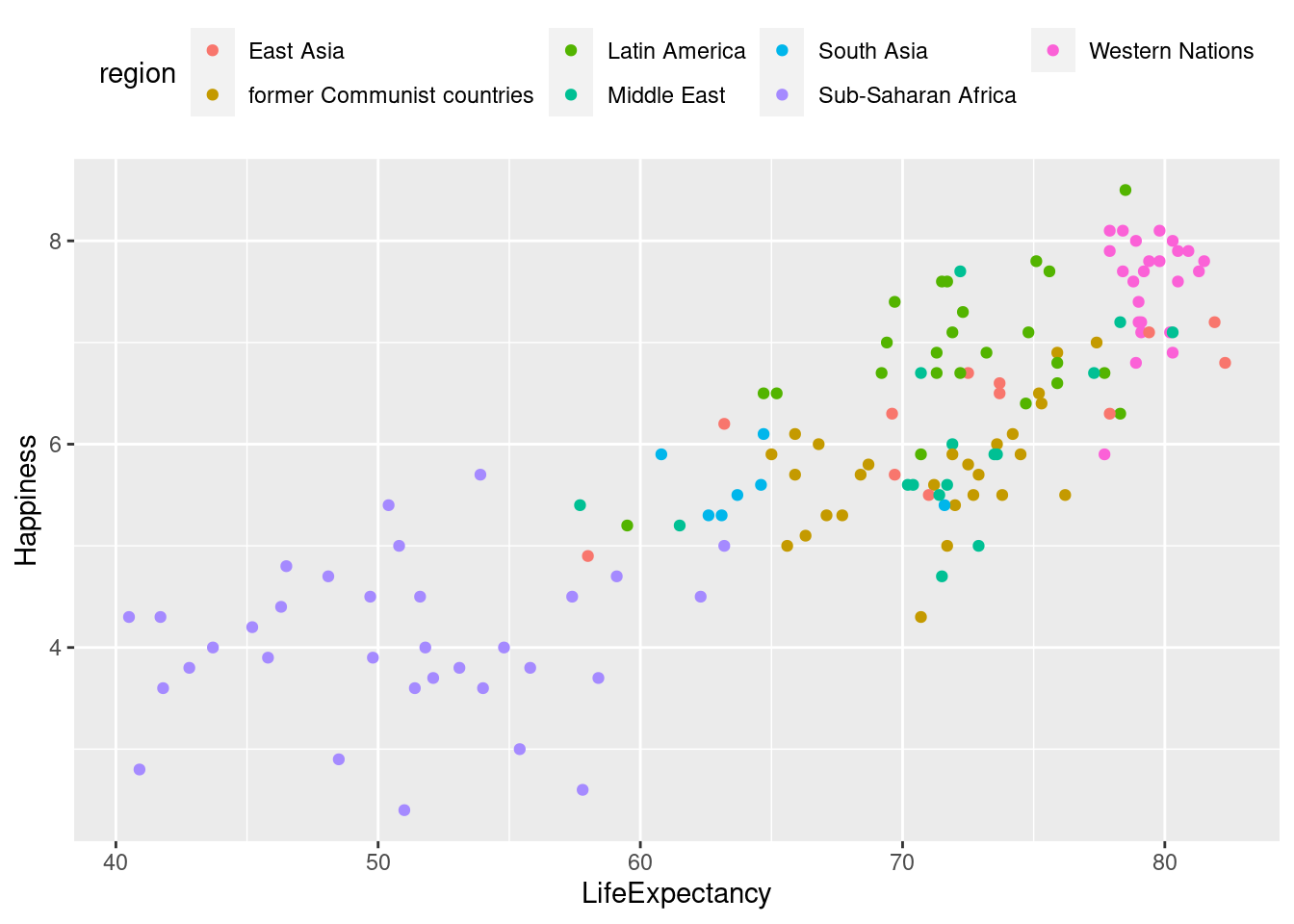
#Placing legend in the top left
lifexp_happy_plot + theme(legend.position = c(.2, .85))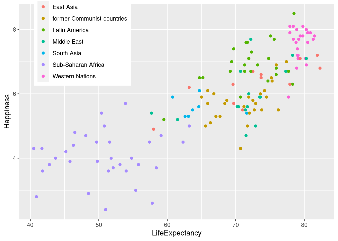
Many plot elements have multiple properties that can be set. For example, line elements in the plot such as axes and gridlines have a color, a thickness (size), and a line type (solid line, dashed, or dotted). To set the style of a line, you use element_line(). For example, to make the axis lines into red, dashed lines, you would use the following.
p + theme(axis.line = element_line(color = "red", linetype = "dashed"))
Similarly, element_rect() changes rectangles and element_text() changes text. You can remove a plot element using element_blank().
# For all rectangles, set the fill color to light grey
lifexp_happy_plot +
  labs(title = "Average Happiness of Countries Compared to Life Expectancy") +
    theme(rect = element_rect(fill = "grey92"),

# For the legend key, turn off the outline
    legend.key = element_rect(color = NA),

# Turn off axis ticks
axis.ticks = element_blank(),

# Turn off the panel grid
panel.grid = element_blank(),

# Add major y-axis panel grid lines back
panel.grid.major.y = element_line(

# Set the color to white
color = "white",

# Set the size to 0.5
size = 0.5,

# Set the line type to dotted
      linetype = "dotted"),

# Set the axis text color to grey25
    axis.text = element_text(color = "#AAAAAA"),

# Set the plot title font face to italic and font size to 16
   plot.title = element_text(size = 16, face = "italic"))
## Warning: The `size` argument of `element_line()` is deprecated as of ggplot2 3.4.0.
## ℹ Please use the `linewidth` argument instead.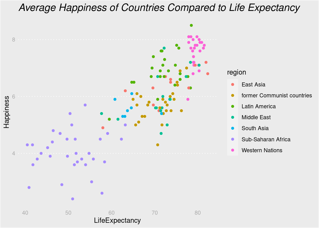
4.4.2 Whitespace
Whitespace means all the non-visible margins and spacing in the plot.
To set a single whitespace value, use unit(x, unit), where x is the amount and unit is the unit of measure.
Borders require you to set 4 positions, so use margin(top, right, bottom, left, unit). To remember the margin order, think TRouBLe.
The default unit is “pt” (points), which scales well with text. Other options include “cm”, “in” (inches) and “lines” (of text).
lifexp_happy_plot +
  labs(title = "Average Happiness of Countries Compared to Life Expectancy") +
    theme(

# Set the axis tick length to 1 lines
    axis.ticks.length = unit(1, "lines"),

# Set the legend key size to 1 centimeters
    legend.key.size = unit(1, "cm"),

# Set the legend margin to (1, 1, 1, 1) points
    legend.margin = margin(1, 1, 1, 1, "pt"),

# Set the plot margin to (5, 5, 5, 5) millimeters
    plot.margin = margin(5, 5, 5, 5, "pt"))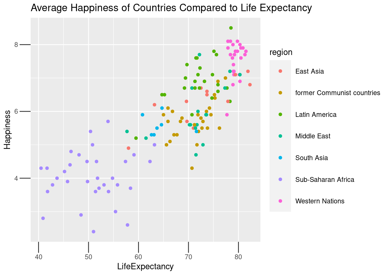
4.4.3 Built-in Themes
In addition to making your own themes, there are several out-of-the-box solutions that may save you lots of time.
theme_gray()is the default.theme_bw()is useful when you use transparency.theme_classic()is more traditional.theme_void()removes everything but the data.
Here are some examples of these and other themes.
lifexp_happy_plot + theme_bw()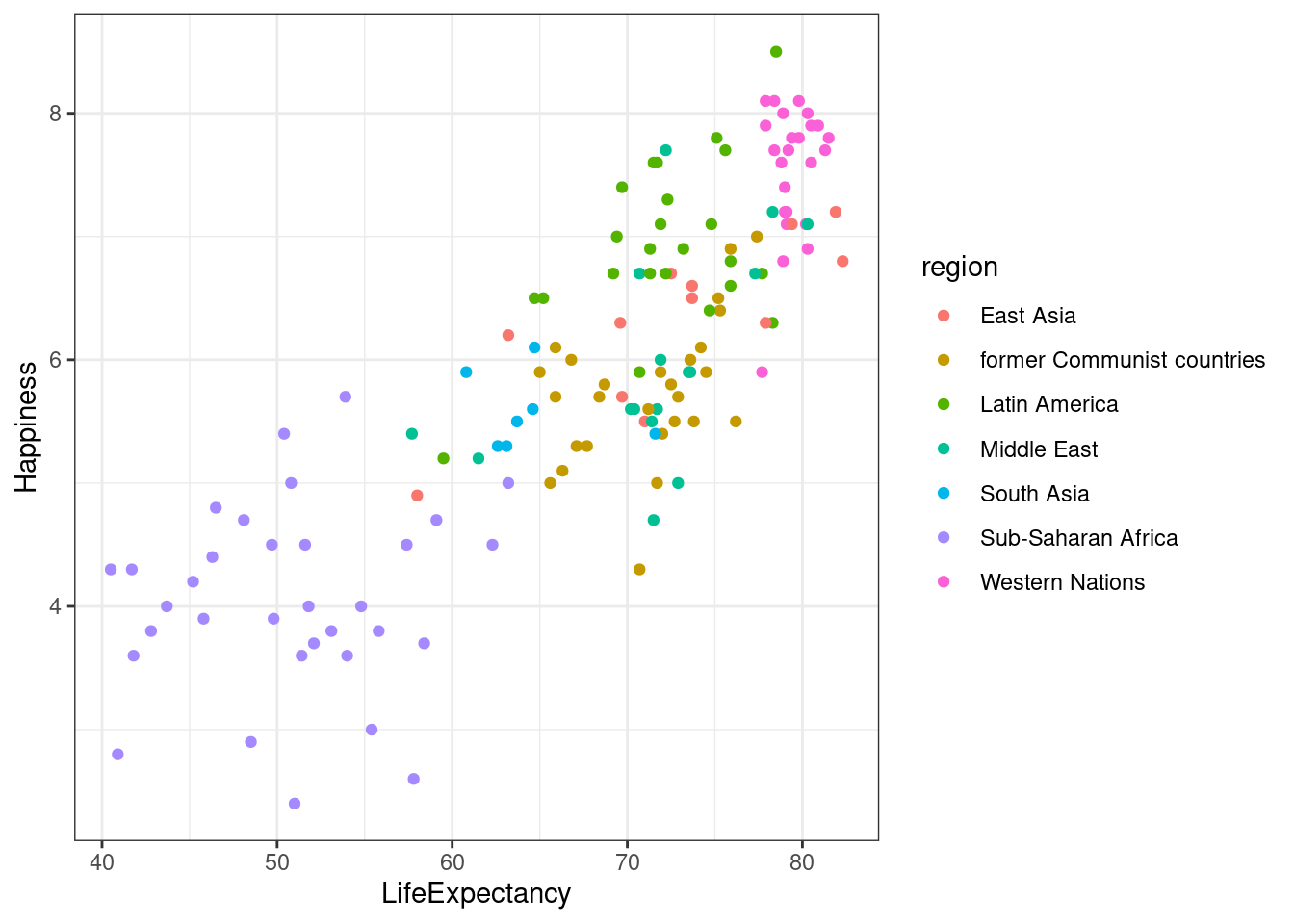
lifexp_happy_plot + theme_void()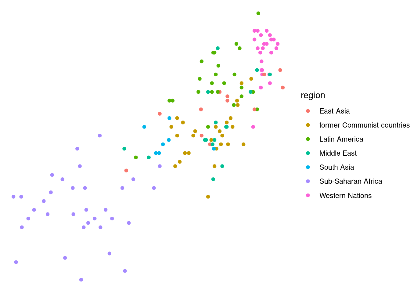
lifexp_happy_plot + theme_wsj()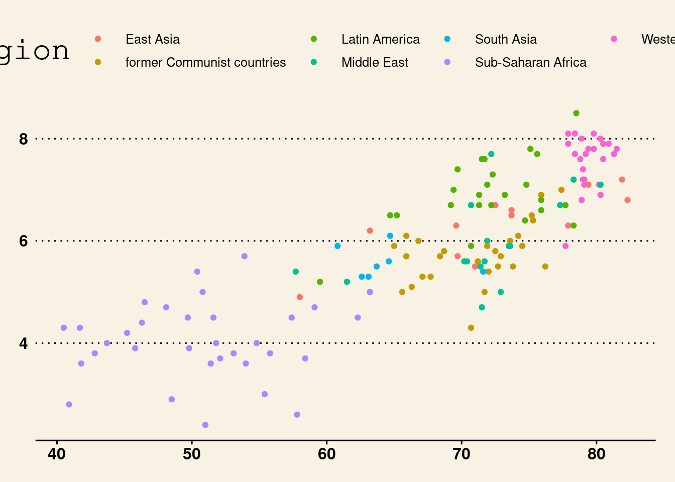
lifexp_happy_plot + theme_clean()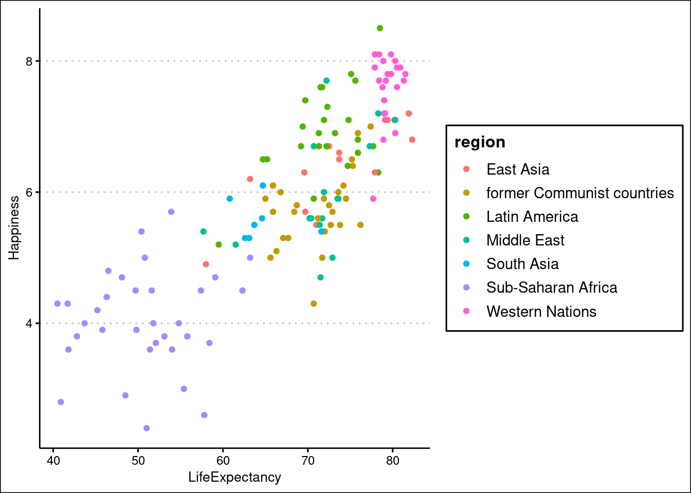
Reusing a theme across many plots helps to provide a consistent style. You have several options for this.
- Assign the theme to a variable, and add it to each plot.
- Set your theme as the default using theme_set().
A good strategy that you’ll use here is to begin with a built-in theme then modify it.
#Creating theme
theme_recession <- theme(
  rect = element_rect(fill = "grey92"),
  legend.key = element_rect(color = NA),
  axis.ticks = element_blank(),
  panel.grid = element_blank(),
  panel.grid.major.y = element_line(color = "white", size = 0.5, linetype = "dotted"),
  axis.text = element_text(color = "grey25"),
  plot.title = element_text(face = "italic", size = 16),
  legend.position = c(0.15, 0.85))

#Add previous them with built-in theme to combine
theme_tufte_recession <- theme_tufte() + theme_recession

#Set this theme as the default theme
theme_set(theme_tufte_recession)

#Print plot without setting theme
lifexp_happy_plot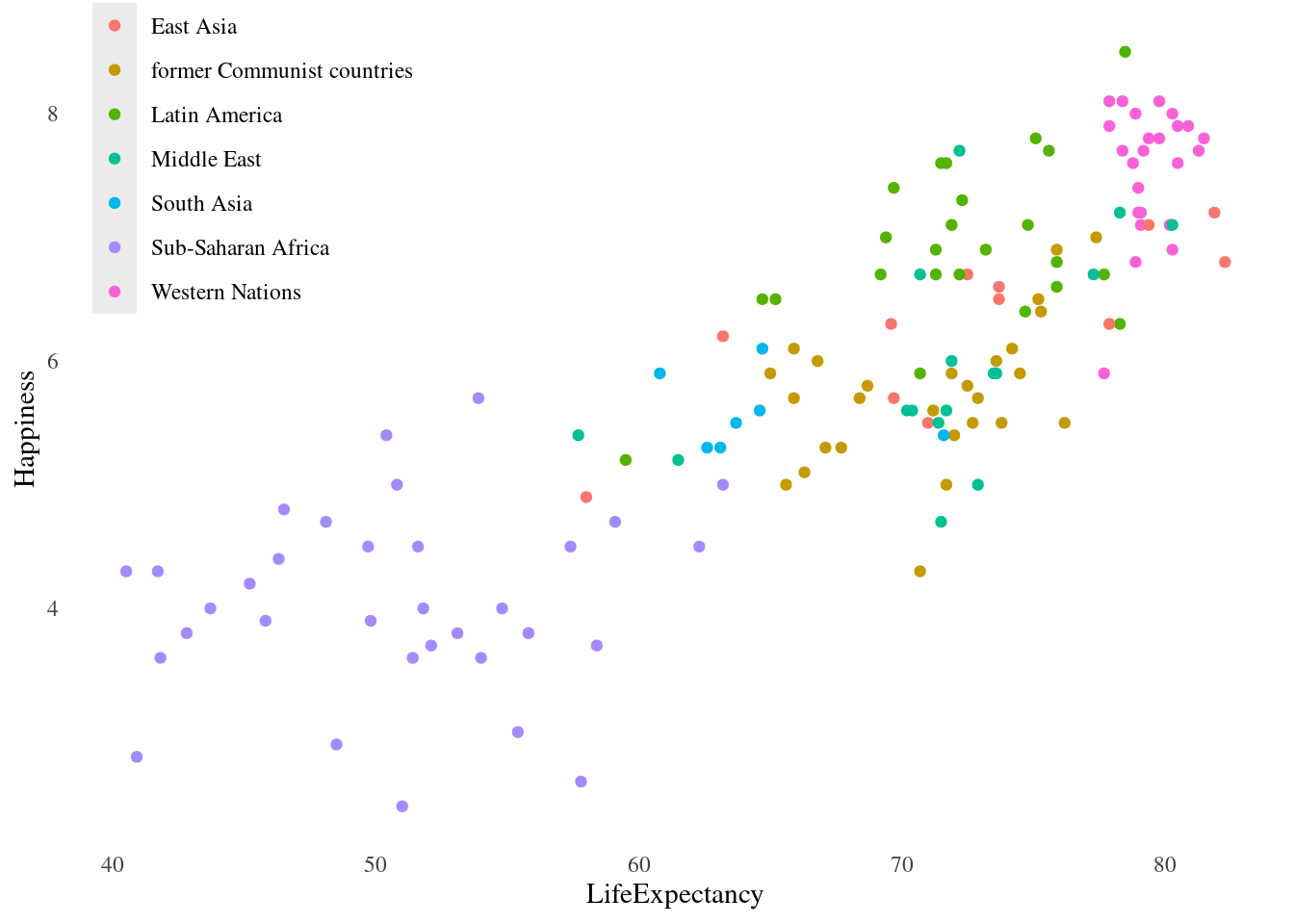
4.4.4 Explanatory Plots
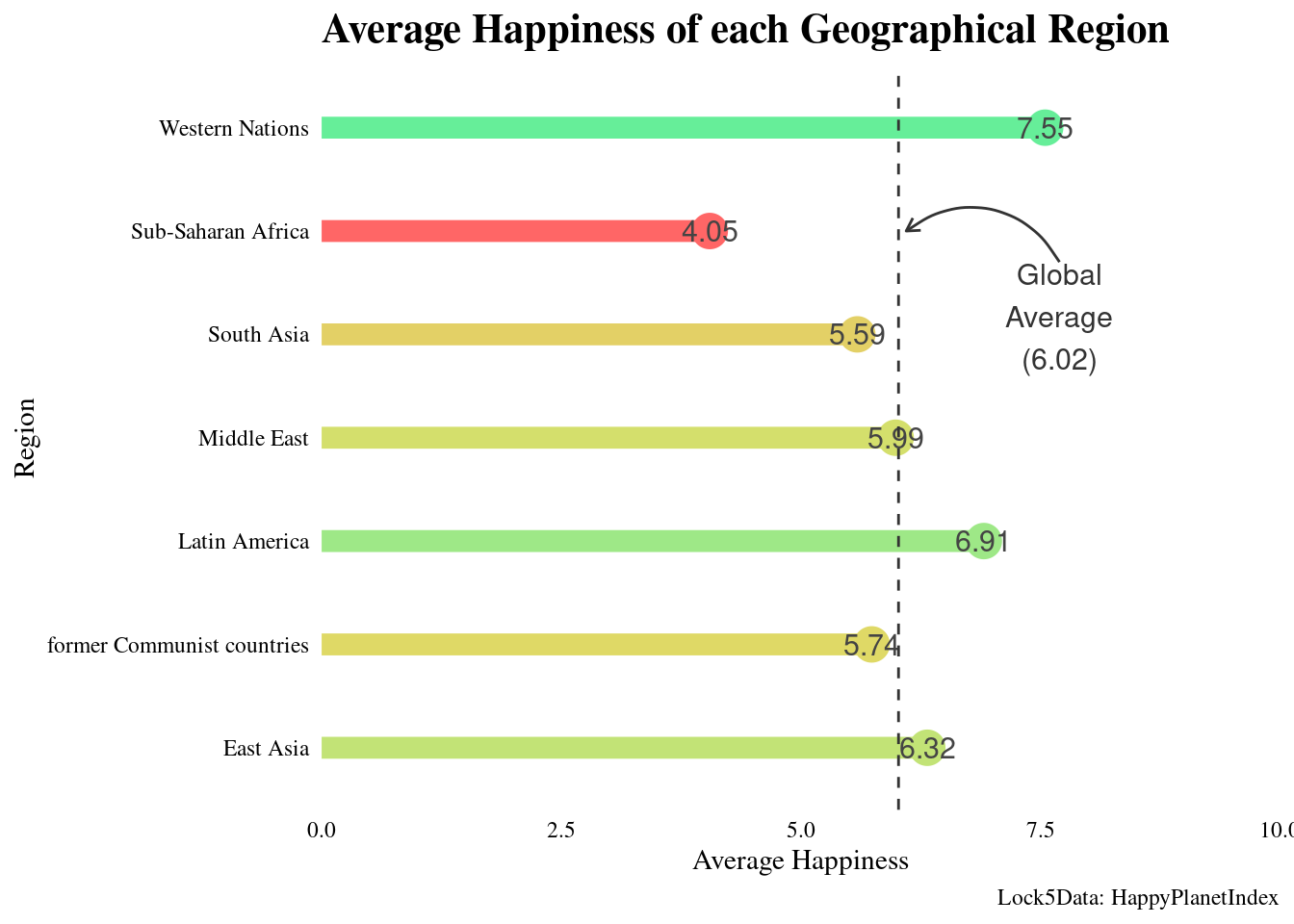
#Create new data set with average happiness of each region
happyregions <- happyplanet %>%
  group_by(region) %>%
    summarize(meanhap = round(mean(Happiness), digits = 2))


#Create new color palette
palette1 <- c("#FF6666", "#DDDD66", "#66EE99")

#Plot happiness v. region with scatterplot, segment, and text
ggplot(happyregions, aes(x = meanhap, y = region, color = meanhap)) +
geom_point(size = 6) +
geom_segment(aes(xend = 0, yend = region), size = 4) +
geom_text(aes(label = meanhap), color = "#444444", size = 4) +

#Set theme
  theme(legend.position = "none", plot.title = element_text(face = "bold"), axis.text = element_text(color = "black")) +

#Set scales and implement color palette
scale_x_continuous("Average Happiness", expand = c(0,0), limits = c(0,10), position = "bottom") +
scale_color_gradientn(colors = palette1) +

#Add titles
labs(title = "Average Happiness of each Geographical Region", caption = "Lock5Data: HappyPlanetIndex") + ylab("Region") +

#Adding vertical line at global average
geom_vline(xintercept = 6.02, color = "grey20", linetype = 2) +

#Adding annotation to label line
annotate("text", x = 7.7, y = 6.7,
    label = "Global\nAverage\n(6.02)",
    vjust = 2, size = 4, color = "grey20") +

#Adding annotation to add arrow to connect line to text
annotate("curve", x = 7.7, y = 5.7,
    xend = 6.1, yend = 6,
    arrow = arrow(length = unit(0.2, "cm"), type = "open"),
    color = "grey20"
  )
## Warning: Using `size` aesthetic for lines was deprecated in ggplot2 3.4.0.
## ℹ Please use `linewidth` instead.